
Common Cause & Special Cause Variation Explained with Examples
Editorial Team

In any business operation, it is important to ensure consistency in products as well as repeatable results. Managers and workers alike have to be aware of the processes and methods on how to produce consistent outcomes at all costs. However, we cannot deny that producing exactly identical products or results is almost impossible as variance tends to exist. Variation is not necessarily a bad thing as long as it is within the standard of the critical to qualities (CTQs) specification limits.
Process variation is the occurrence when a system deviates from its fixed pattern and produces a result which differs from the usual ones. This is a major key as it concerns the consistencies of the transactional as well as the manufacturing of the business systems. Variation should be evaluated as it portrays the reliability of the business for the customers and stakeholders. Variation may also cost money hence it is crucial to keep variation at bay to prevent too much cost spent on variation. It is crucial to be able to distinguish the types of variance that occur in your business process since it will give the lead on what course of action to take. Mistakes in coming up with an effective reaction plan towards the variance may worsen the processes of the business.
There are two types of process variation which will be further elaborated in this article. The variations are known as common cause variation and special cause variation.
Common Cause Variation Definition
Common cause variation refers to the natural and measurable anomalies that occur in the system or business processes. It naturally exists within the system. While it is true that variance may bring a negative impact to business operations, we cannot escape from this aspect. It is inherent and will always be. In most cases, the common cause variant is constant, regular, and could be predicted within the business operations. The other term used to describe this variation is Natural Problems, Noise, or Random Cause. Common cause variance could be presented and analysed using histogram.
What is Common Cause Variation
There are several distinguishable characteristics of common cause variation. Firstly, the variation pattern is predictable. Common cause variation occurring is also an active event in the operations. it is controlled and is not significantly different from the usual phenomenon.
There are many factors and reasons for common cause variation and it is quite difficult to pinpoint and eliminate them. Some common cause variations are accepted within the business process and operations as long as they are within a tolerable level. Eradicating them is an arduous effort unless a drastic measure is implemented towards the operation.
Common Cause Variation Examples
There is a wide range of examples for common cause variation. Let’s take driving as an example. Usually, a driver is well aware of their destinations and the conditions of the path to reach the destination. Since they have been regularly using the same road, any defects or problems such as bumps, conditions of the road, and usual traffic are normal. They may not be able to precisely arrive at the destination at the same duration every time due to these common causes. However, the duration to arrive at the destination may not be largely differing day to day.
In terms of project-related variations, some of the examples include technical issues, human errors, downtime, high trafficking, poor computer response times, mistakes in standard procedures, and many more. Some other examples of common causes include poor design of products, outdated systems, and poor maintenance. Inconducive working conditions may also result in to common cause variants which could comprise of ventilation, temperature, humidity, noise, lighting, dirt, and so forth. Errors such as quality control and measurement could also be counted as common cause variation.
Special Cause Variation Definition
On the other hand, special cause variation refers to the unforeseen anomalies or variance that occurs within business operations. This variation, as the name suggests, is special in terms of being rare, having non-quantifiable patterns, and may not have been observed before. It is also known as Assignable Cause. Other opinions also mentioned that special cause variation is not only variance that happens for the first time, a previously overlooked or ignored problem could also be considered a special cause variation.
What is Special Cause Variation
Special cause variation is irregular occurrences and usually happens due to changes that were brought about in the business operations. It is not your mundane defects and may be very unpredictable. Most of the time, special cause variation happens following the flaws within the business processes or mechanism. While it may sound serious and taxing, there are ways to fix this which is by modifying the affected procedures or materials.
One of the characteristics of special cause variation is that it is uncontrolled and hardly predictable. The outcome of special causes variation is significantly different from the usual phenomenon. Since the issues are not predictable, it is usually problematic and may not even be recorded in the historical experience base.
Special Cause Variation Examples
As mentioned earlier, special cause variations are unexpected variants that occur due to factors that may affect the business system or operations. Let’s have an example of a special cause using the same scenario as previously elaborated for common cause variation example. The mentioned defects were common. Now, imagine if there is an unexpected accident that happens on the same road you usually take. Due to this accident, the time for the driver to arrive at the same destination may take longer than normal. Hence this accident is considered as a special cause variation. It is unexpected and results in a significantly different outcome, in this case, a longer time to arrive at the destination.
The example of special cause variation in the manufacturing sector includes environment, materials, manpower, technology, equipment, and many more. In terms of manpower, imagine a new employee is recruited into the team and still lacking in experience. The coaching and instructions should be adapted to consider that the person needs more training to be able to perform their tasks efficiently. Cases where a new supplier is needed in a short amount of time due to issues faced by the existing supplier are also unforeseen hence considered a special cause variation. Natural hazards that are beyond predictions may also be categorized into special cause variation. Some other examples include irregular traffic or fraud attack. An unexpected computer crash or malfunction in some of the components may also be considered as a special cause variation.
Common Cause and Special Cause Variation Detection
Control chart
One of the ways to keep track of common cause and special cause variation is by implementing control charts. When using control charts, the important aspect to be considered is firstly, establishing the average point of measurement. Next, establish the control limits. Usually, there are three standard deviations which are marked above and below the average point earlier. The last step is by determining which points exceed the upper and lower control limits established earlier. The points beyond the limits are special cause variation.
Before we get into the control chart of common cause and special cause variation, let’s have a look at the eight control chart rules first. If a process is stable, the points displayed in the chart will be near the average point and will not exceed the control limits.
| 1 | Beyond Limits | One or more points exceed control limits |
| 2 | Zone A | 2 out of 3 continuous points in Zone A or beyond |
| 3 | Zone B | 4 out of 5 continuous points in Zone B or beyond |
| 4 | Zone C | 7 or more continuous points in Zone C or beyond |
| 5 | Trend | 7 consecutive points inclining upwards or downwards |
| 6 | Mixture | 8 continuous point with no points in Zone C |
| 7 | Stratification | 15 continuous points in Zone C |
| 8 | Over-control | 14 continuous points alternating up and down |
However, it should be noted that not all rules are applicable to all types of control charts. That aside, it is quite tough to identify the causes of the patterns since special cause variation may be related to the specific type of processes. The table presented is the general rule that could be applied in most cases but is also subject to changes or differences. Studying the chart should be accompanied by knowledge and experiences in order to pinpoint the reasons for the patterns or variations.
A process is considered stable if special cause variation is not present, even if a common cause exists. A stable operation is important before it could be assessed or being improved. We could look at the stability or instability of the processes as displayed in control charts or run charts .
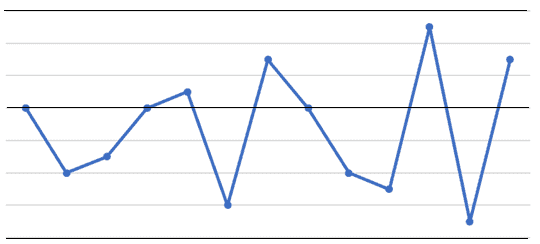
The points displayed in the chart above are randomly distributed and do not defy any of the eight rules listed earlier. This indicates that the process is stable.
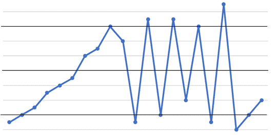
The chart presented above is an example of an unstable process. This is because some of the rules for control chart tests mentioned earlier are violated.
Simply, if the points are randomly distributed and are within the limit, they may be considered as the common cause variation. However, if there is a drastic irregularity or points exceeding the limit, you may want to analyse more into it to determine if it is a special cause variation.
Histogram is a type of bar graph that could be used to present the distribution of occurrences of data. It is easily understandable and analysed. A histogram provides information on the history of the processes done as well as forecasting the future performance of the operations. To ensure the reliability of the data presented in the histogram, it is essential for the process to be stable. As mentioned earlier, although affected by common cause variation, the processes are still considered stable, hence histogram may be used on this occasion, especially if the processes undergo regular measurement and assessment.
The data is considered to be normally distributed if it portrays a “bell” shape in the histogram. The data are grouped around the central value and this cluster is known as variation. There are several other examples of more complicated patterns, such as having several peaks in the histogram or a shortened histogram. Whenever these examples of complex structures appear in the histogram, it is fundamental to look into the data and operations more deeply.
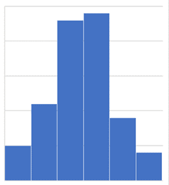
The above bar graph is an example of the histogram with a “bell” shape.
However, it should be noted that just because the histogram displays a “bell” shaped distribution, that does not mean the process is only experiencing common cause variation. A deeper analysis should be done to investigate if there were other underlying factors or causes that lead towards the pattern of the distribution displayed in the histogram.
Countering common cause and special cause variation
Once the causes of the variation have been pinpointed, here comes the attempt to combat and resolve it. Different measures are implemented to counter different types of variation, i.e. common cause variation and special cause variation. Common cause variation is quite tough to be completely eliminated. Drastic or long-term process modification could be used to counter common cause variation. A new method should be introduced and constantly conducted to achieve the long-term goal of eliminating the common cause variation. Some other effects may happen to the operations but as time passes, the cause may be gradually solved. As for special cause variation, it could be countered using contingency plans. Usually, additional processes are implemented into the usual operation in order to counter the special cause variation.
- What To Do If You Have “A Perfect Student” Syndrome?
- How to Effectively Find and Use the Best Possible Suppliers in 2022
- 5 Reasons to Screen Potential Employees
- Why It’s Important to Hire an InventHelp Patent Attorney?
most recent

The Future of Trade Automation: How Shipping Platforms Are Transforming Global Commerce

ChargePoint Business Model: A Comprehensive Review

Website Rental Business Model: A Comprehensive Review
© 2024 Copyright ProjectPractical.com

An official website of the United States government
The .gov means it’s official. Federal government websites often end in .gov or .mil. Before sharing sensitive information, make sure you’re on a federal government site.
The site is secure. The https:// ensures that you are connecting to the official website and that any information you provide is encrypted and transmitted securely.
- Publications
- Account settings
Preview improvements coming to the PMC website in October 2024. Learn More or Try it out now .
- Advanced Search
- Journal List
- HHS Author Manuscripts
Know It When You See It: Identifying and Using Special Cause Variation for Quality Improvement
In this month’s Hospital Pediatrics , Liao et al 1 share their team’s journey to improve the accuracy of their institution’s electronic health record (EHR) problem list. They presented their results as statistical process control (SPC) charts, which are a mainstay for visualization and analysis for improvers to understand processes, test hypotheses, and quickly learn their interventions’ effectiveness. Although many readers might understand that 8 consecutive points above or below the mean signifies special cause variation resulting in a centerline “shift,” there are many more special cause variation rules revealed in these charts that likely provided valuable real-time information to the improvement team. These “signals” might not be apparent to casual readers when looking at the complete data set in article form.
Shewhart 2 first introduced SPC charts to the world with the publication of Economic Control of Quality of Manufactured Product in 1931. Although control charts were initially used more broadly in industrial settings, health care providers have also recently begun to understand that the use of SPC charts is vital in improvement work. 3 , 4 Deming, 5 often seen as the “grandfather” of quality improvement (QI), saw SPC charts as vital to understanding variation as part of his well-known Theory of Profound Knowledge, outlined in his book The New Economics for Industry Government, Education . Improvement science harnesses the scientific method in which improvers create and rapidly test hypotheses and learn from their data to determine if their hypotheses are correct. 6 This testing is central to the Model for Improvement’s plan-do-study-act cycle. 3 Liao et al 1 nicely laid out their hypotheses in a key driver diagram, and they tested these hypotheses with multiple interventions. In the following paragraphs, we will walk through some of their SPC charts to demonstrate how this improvement team was gaining valuable knowledge about their hypotheses through different types of special cause variation long before they had 8 points to reveal shifts. We recommend readers have the charts from the original article (OA) available for reference.
A fundamental concept in improvement science is understanding the difference between common cause and special cause variation. By understanding how to apply these concepts to your data, you will more quickly identify when a change has occurred and whether action should be taken. The authors’ SPC charts reveal examples of both common cause and special cause variation.
Common cause variations are those causes that are inherent in the system or process. 4 Evidence of common cause variation can be seen visually in the OA’s Fig 3, from January 2017 to October 2017, because the data points vary around the mean but remain between the upper and lower control limits (dotted lines). In contrast, special cause variations are causes of variations that are not inherent to the system. 4 Although there are different rules that signify special cause variation in SPC charts, some of the most common rules that we will focus on here include (1) a single data point outside of the control limits, (2) 8 consecutive points above or below the mean line, and (3) ≥6 consecutive points all moving in the same direction, termed a “trend.” 4 When any of these occur, it is paramount to identify when and why the special cause occurred, learn from the special cause, and then take appropriate action. By quickly detecting special cause variation, improvement teams can more readily assess the impact of interventions by validating whether their hypothesis for improvement is correct.
An example of special cause variation can be seen in the OA’s Fig 2, noted by the shift in the centerline in May 2018 from a baseline of 70% of problem lists revised during admission to a new centerline of 90% of problem lists reviewed during admission. Notice that this new, stable process represented by the new centerline starts after the team tested 3 separate interventions that were directly testing hypotheses related to their key drivers. Although the shift began in May 2018, the first special cause signal the improvement team would have seen is the first point outside of the upper control limit in January 2018, which comes immediately after their first 2 interventions. As more months go by, each month after continues to represent special cause variation because they are outside of the control limits. Finally, when the data point in May 2018 is plotted, it is apparent that an upward trend started in December 2017, with 6 consecutive data points increasing through May 2018. Therefore, the authors recognized special cause variation (a trend) by having 6 consecutive increasing points. Given their interventions were grounded in theory and the temporal relationship of the trend beginning in December 2017, with the preceding interventions in November and December 2017, there is a high degree of belief that the interventions are driving these results. In other words, their hypothesis that the EHR enhancements, the dissemination of a protocol, and the designation of a bonus would improve the percentage of times that the problem list is “reviewed” was confirmed as early as December 2017, long before the eventual centerline shift in May 2018.
Figure 3 in the OA is an SPC chart of one of the team’s process measures revealing the percentage of discharges with duplicate codes on the problem list. The authors demonstrate that the November 2017 EHR impacted the process, reducing the mean from 12% to 7%. The data contained in our Fig 1 are the same data as those shown in Fig 3 of the authors’ OA but without the first centerline shift, which reveals what the authors would have seen in real time during the course of their improvement efforts. With the November 2017 data point (labeled point 1 in Fig 1 ), the authors immediately have evidence of special cause variation, with a point outside of the lower control limit after their intervention. This continues with points 2 through 5, each below the lower control limit. Statistically speaking, any one of these is unlikely to happen by chance (which is why they are considered special cause), but the fact that the team is seeing this month after month reinforced their hypothesis. With the eighth consecutive point below the mean line occurring in June 2018 (circle), the team was able to finally shift the centerline. Looking at this from the perspective of the improvement team, the immediacy and consistency of feedback that they witnessed with points outside of the control limits from November 2017 through March 2018 were likely much more informative to their improvement efforts than the moment when they finally were able to shift the mean line. The authors highlight that the EHR enhancement was chosen for its higher reliability design concept, 7 making it easier for the providers to complete the intended behavior. The immediacy of special cause signal in November 2017 would indicate that their hypothesis was correct.

OA Fig 3 re-designed to represent data visualization prior to centerline shift.
Finally, viewing charts in combination provides further support of the team’s overall improvement theory. Notice that the special cause shift in Fig 3 of the OA (a process measure) occurs at the same time as the beginning of the special cause that is noted in Fig 2 of the OA, which is their outcome measure. In this case, a driving change in their process was temporally associated with recognizable change in their outcome. Similarly, the OA’ Fig 4, viewed in combination with its Figs 2 and 3, provide our final example of how revealing special cause variation across measures relates to the broader theory of the team’s improvement. Special cause variation is evident in Fig 4 of the OA, with points outside of the control limits associated with interventions in both November and December 2019. A similar pattern is seen in the authors’ other process measure chart, Fig 3 of the OA, during those same months associated with those interventions. Here, a couple of associations are addressed in the data. First, a high degree of belief that those two interventions affect those measures is provided in the data, as the authors hypothesized. Second, with such data, the authors also confirm the hypothesis that underlies the entire article: simply “reviewing” the problem list is also associated with active management of the problem list, and improvements to their process measures help drive their outcome. After >1.5 years of a fairly stable outcome measure (mainly common cause variation), the team’s use of these two interventions not only improved their process measures but also were associated with the December 2019 data point being outside of the control limits in the outcome measure in Fig 2 of the OA. In these situations, the team’s use of SPC charts provided the ability to understand relationships between process and outcome measures, in addition to rapidly testing hypotheses.
As revealed in the work by Liao et al, 1 we can improve the care we provide to patients every day with QI methodology. When researchers use SPC charts to report QI in scholarly venues such as this, readers often focus on centerline shifts. Although improvement teams take great joy in shifting a centerline, experienced teams much more commonly work to detect other types of special cause variation quickly to test their hypotheses and work through plan-do-study-act cycles. By understanding the rules of special cause variation and applying them to data in real time, teams will be provided with information that will inform hypotheses testing, bolster knowledge about a system, and ultimately accelerate improvement work.
Acknowledgments
FUNDING: Supported by the Agency for Healthcare Research and Quality (grant T32HS026122). The content is solely the responsibility of the authors and does not necessarily represent the official views of the Agency for Healthcare Research and Quality.
FINANCIAL DISCLOSURE: The authors have indicated they have no financial relationships relevant to this article to disclose.
POTENTIAL CONFLICT OF INTEREST: The authors have indicated they have no potential conflicts of interest to disclose.

Guest Column | February 15, 2021
7 rules for properly interpreting control charts.
By Mark Durivage , Quality Systems Compliance LLC

Control charts build upon periodic inspections by plotting the process outputs and monitoring the process for special cause variation or trends. Control charts are decision-making tools that provide information for timely decisions concerning recently produced products.
Control charts can be used to identify sources of variation, both common and special cause. Common cause variation is the variation inherent in the process. Common cause variation is also known as the noise of the process. A process with only common cause variation is highly predictable. A process that has a significant inherent common cause variation may not be capable of producing products that meet predetermined specifications. Common cause variation is said to account for 80% of the variation in any process and is considered management’s responsibility.
Special cause variation is variation that is not inherent to the process. A process with special cause variation is highly unpredictable. Special cause variation is said to account for 20% of the variation in any process and is considered the worker’s responsibility.
Control charts contain a centerline — usually the mathematical average of the samples plotted — and upper and lower statistical control limits that define the constraints of common cause variation and performance data plotted over time.
There are two general classifications of control charts: variables and attributes charts. Variables are things that can be measured. Attributes are things that can be counted. The type of data (variable or attribute) will dictate the appropriate type of control chart required to monitor a process. Table 1 can be used for control chart selection.
Table 1: Control Chart Selection Guide

Selection of the correct type of control chart is important to ensure the underlying statistical concepts are appropriate for the feature or attribute being measured.
A process is said to be in control when the control chart does not indicate any out-of-control condition and contains only common causes of variation. If the common cause variation is small, then a control chart can be used to monitor the process. If the common cause variation is too large, the process will need to be modified or improved to reduce the amount of inherent variation to an acceptable level.
When a control chart indicates an out-of-control condition (a point outside the control limits or matching one or more of the criteria in the rules below), the assignable causes of variation must be identified and eliminated.
The following rules can be used to properly interpret control charts:
Rule 1 – One point beyond the 3 σ control limit
Rule 2 – Eight or more points on one side of the centerline without crossing
Rule 3 – Four out of five points in zone B or beyond
Rule 4 – Six points or more in a row steadily increasing or decreasing
Rule 5 – Two out of three points in zone A
Rule 6 – 14 points in a row alternating up and down
Rule 7 – Any noticeable/predictable pattern, cycle, or trend
Analyzing a control chart for special cause variation can be facilitated by using the categories used with a cause-and-effect diagram. The flowing are the categories that I prefer to use:
- Equipment, Machines, and Tooling
- Environment

Rule 1, one point beyond the 3 σ control limits, seeks to identify points that are random or outliers, as shown here in red. When random or outlier points are identified, the following are potential special causes to consider:
- improper start-up
- improper setup
- sudden support system failure (cooling, heating, compressed air, vacuum, steam, etc.)
- tool failure/breakage
- equipment or machine failure
- improper equipment, machine, and tooling maintenance
- utility interruption
- temperature suddenly too low/high
- humidity suddenly too low/high
- equipment has not stabilized (warmed-up)
- inadequate work instructions
- missed process step
- new process
- inspection, measuring, and testing equipment not properly calibrated
- damaged inspection, measuring, and testing equipment
- change in raw materials
- change in components
- handling damage
- expired materials
- new operators
- inadequate training
- operator interrupted or distracted
- operator overcompensating when making process adjustments

Rule 2, eight or more points on one side of the centerline without crossing, is considered a prominent shift (the shift can be on either side of the centerline). The points circled in red are considered a prominent shift. When a prominent shift is identified, the following are potential special causes to consider:
- damaged tooling
- temperature shifted too low/high
- humidity shifted too low/high
- new process parameters
- incorrect process parameters
- process has improved
- process has degraded
- shift change

Rule 3, four out of five points in zone B or beyond, is considered a small shift (the shift can be on either side of the centerline). The points circled in red are considered small shifts. When a small shift is identified, the following are potential special causes to consider:
- intermittent support system failure (cooling, heating, compressed air, vacuum, steam, etc.)
- inspection, measuring, and testing equipment not adequate for the intended use
- mixed raw materials
- mixed components

Rule 4, six points or more in a row steadily increasing or decreasing, is considered a trend (the trend can be rising or falling). The points circled in red are considered a trend. When a trend is identified, the following are potential special causes to consider:
- gradual support system failure (cooling, heating, compressed air, vacuum, steam, etc.)
- temperature gradually drifting too low/high
- humidity gradually drifting too low/high
- process is slowly degrading
- variation in the raw materials
- variation in the components
- operator distracted

Rule 5, two out of three points in zone A, is considered a large shift. (the shift can be on either side of the centerline). The points circled in red are considered large shifts. When a large shift is identified, the following are potential special causes to consider:
- support system failure (cooling, heating, compressed air, vacuum, steam, etc.)

Rule 6, 14 points in a row alternating up and down, is generally considered to be overcontrol. The points enclosed in red are considered out of control. When this situation is identified, the following are potential special causes to consider:
- temperature intermittently too low/high
- humidity intermittently too low/high
- operator not waiting for the process to stabilize before making process adjustments
Please note, even though the operator may be over adjusting the process, there may be other special causes present.

Rule 7 is any noticeable/predictable pattern, cycle, or trend. The points circled in red are considered out of control. When these situations are identified, the following are potential special causes to consider:
- two or more processes
- multiple shifts
Stratification

When stratification is identified, it is generally due to one of two issues. The operators are purposefully truncating the measurements, or the process has improved significantly, which will require the recalculation of the statistical control limits.
It is time to consider augmenting your validated pharmaceutical, medical device, and tissue production processes, including processing, packaging, and labeling, with continuous process monitoring using control charts to ensure continued compliance with established specifications and requirements.
When implementing control charts as part of your continuous process monitoring activities, ensure the people responsible for completing the charts have been properly trained and understand the seven rules presented in this article.
I cannot emphasize enough the importance of establishing documented procedures to manage the tools and methods used. Best practice includes providing the rationale for your organization’s use of control charts for continuous process monitoring. The methods and tools presented in this article can and should be utilized based upon industry practice, guidance documents, and regulatory requirements.
References:
- Durivage, M.A., 2014, Practical Engineering, Process, and Reliability Statistics, Milwaukee, ASQ Quality Press
- Durivage, M.A., and Mehta, B., 2016, Practical Process Validation, Milwaukee, ASQ Quality Press
- Durivage, M.A., 2020, https://www.pharmaceuticalonline.com/doc/how-to-implement-continuous-process-monitoring-of-validated-processes-0001
About The Author:

Like what you are reading?
Sign up for our free newsletter, newsletter signup.

Lean Six Sigma Training Certification
- Facebook Instagram Twitter LinkedIn YouTube
- (877) 497-4462
What is Special Cause Variation? How to Identify It?
March 8th, 2024
Variations are inherent in any process and the sources of these variations play a crucial role in determining process performance and stability. While common cause variations are predictable and result from the process design itself, special cause variation arise due to unexpected factors and lead to process instability.
Managing these special cause variations by identifying and eliminating their root causes is an integral part of quality management frameworks like Six Sigma and Lean. By doing so, processes can achieve stability and enhanced capability.
This enables improved competitiveness through cost reduction, lead time reduction, improved quality, and higher customer satisfaction.
Thus, organizations invest significant efforts in detecting and managing special causes of variation in their business processes.
Understanding Special Cause Variation
Special cause variation refers to fluctuations in a process that happen because of unique or unusual factors that are not normally present.
These unnatural variations are unpredictable and assignable to a specific cause . They indicate that the process has become unstable and is producing defects or undesirable outcomes.
Difference from Common Cause Variation
Common cause variation refers to natural or expected variability that exists in any process. This type of variation happens due to minor, ubiquitous causes that are inherent in the process design.
Common causes lead to random scattering of data points around the mean. On the other hand, special causes produce data points that stand out from the normal pattern of variation and signal that the process is out of control.
While common cause variation indicates a stable process, special cause variation implies instability requiring investigation and corrective action.
Importance in Quality Management
Effective management of special cause variation is crucial for organizations looking to enhance their quality management programs.
By properly identifying and addressing special causes, companies can boost competitiveness, better meet customer expectations, and positively impact financials.
Enhancing Competitiveness with Special Cause Variation
In today’s business landscape, quality has become a key competitive differentiator across industries. Companies that demonstrate consistent product/service quality and continuous improvement initiatives can gain an edge.
The ability to rapidly detect and mitigate special causes of variation enables organizations to enhance process stability .
This prevents the occurrence of unexpected defects and non-conformances which can erode quality perception. Maintaining robust quality standards is essential to stay ahead.
Connecting with Quality-Focused Customers
Customers are increasingly assessing providers based on their quality management record and commitment to zero defects.
By tackling special cause variations through root cause analysis , corrective actions, and control mechanisms. etc. companies can limit unexpected issues that lead to customer dissatisfaction.
This accountability and proactive quality management culture aligns with customer requirements and values.
Communicating such initiatives and results also reassures customers regarding consistency. This helps strengthen loyalty and presents partnership opportunities with quality-focused customers.
Identifying Special Cause Variation
Special cause variation is often difficult to detect without the right analysis tools. Identifying special causes requires going beyond typical process monitoring to specialized statistical techniques.
There are three main methods for recognizing when variation is due to special causes:
Control Charts
Control charts are the most common way to identify special cause variation. Control charts plot data over time with statistically derived upper and lower control limits.
When data points fall outside these control limits , it indicates something unexpected has happened to the process.
This unexpected variance points to special causes rather than expected normal variation.
Common control charts used to monitor special causes include Xbar-R charts , Xbar-S charts , Individual charts, moving range charts, and P charts.
Statistical process control software makes it easy to generate control charts and receive alerts when special causes occur.
Statistical Process Control
Statistical process control (SPC) is an analytical methodology that makes extensive use of control charts.
SPC carefully monitors processes to distinguish between expected and unexpected variations using statistical methods.
By visually separating normal and special cause variations on control charts, SPC provides objective evidence that can pinpoint the timing and magnitude of special causes.
SPC also calculates metrics like Cp and Cpk that quantify overall process variation and process capability.
Tracking these metrics provides further insight into process stability versus areas with heightened special cause variation.
Root Cause Analysis
When control charts or SPC identify special cause variation, the next step is to determine the root cause. Root cause analysis gets to the underlying reason why the unexpected process change happened.
Various tools like the 5 Whys , fishbone diagrams , and failure mode analysis help uncover root causes. Tracing special cause variation back to the root cause is crucial for addressing problems permanently.
Otherwise, the same special cause could keep affecting the process unpredictably.
Implications of Special Cause Variation
Special cause variation can have major implications if left unchecked.
Understanding and properly dealing with special causes is crucial for organizations that want to achieve process stability, improve customer satisfaction, and boost financial performance.
Process Stability with Special Cause Variation
The presence of special cause variation indicates an unstable process. The output and performance metrics of an unstable process fluctuate unpredictably.
This makes the process unreliable and difficult to control. Identifying and eliminating special causes is the first step toward stabilizing a process.
Stable processes have consistent output and are predictable, easier to monitor, and simpler to improve.
Customer Satisfaction
Customers expect consistent quality and on-time delivery of products and services. An unstable process leads to unpredictable product quality and delivery delays which frustrates customers. Fixing special causes improves process stability and capability.
This enables organizations to reliably meet customer expectations and increase satisfaction levels. Satisfied customers lead to repeat purchases and valuable word-of-mouth publicity.
Financial Performance
Unstable processes lead to increased waste, rework, and returns. The additional effort and resources needed to fix these issues drive up costs and hurt profitability.
Special cause variation can also result in production and shipment delays that mean missed revenue opportunities and penalties.
Eliminating special causes reduces costs and improves process efficiency . This directly translates into increased profit margins, higher ROI, and stronger financial performance.
Strategies for Management of Special Cause Variation
Effectively managing special cause variation is critical for organizations looking to improve quality, reduce costs, and boost customer satisfaction.
When a process experiences special cause variation, it indicates an unexpected change that needs to be addressed. Implementing targeted strategies can help get processes back into a state of statistical control.
Corrective Actions
- Once a special cause is identified through statistical process control methods, structured problem-solving methodologies like PDCA (Plan-Do-Check-Act) or DMAIC (Define, Measure, Analyze, Improve, Control) can be utilized to develop corrective actions.
- Brainstorming sessions to determine potential causes and solutions can provide useful insights from team members. Fishbone diagrams are an effective tool to visually map out causes.
- Pilot testing proposed improvements on a small scale first to evaluate potential impact.
- Verify the effectiveness of corrective actions by monitoring the process over time using control charts. Special causes should be removed and variation should return to baseline common cause levels.
Continual Improvement with Special Cause Variation
- Schedule periodic reviews of processes, even in the absence of special causes, to identify opportunities for incremental improvements.
- Utilize lean tools like 5S , poka-yoke , and process mapping to reduce waste and enhance process stability.
- Keep the workforce engaged by encouraging them to share improvement ideas and recognize implementation efforts.
- Consider automating certain process steps to reduce variability induced by human errors.
- Review process performance metrics regularly to ensure improvements are sustained over longer periods.
- Conduct refresher training for employees on methods like statistical process control, Six Sigma, and hypothesis testing.
By taking a structured approach combining short-term corrective actions and long-term continual improvement , organizations can effectively manage special cause variation events.
This drives greater consistency and stability in processes, directly enhancing product quality and customer satisfaction.
SixSigma.us offers both Live Virtual classes as well as Online Self-Paced training. Most option includes access to the same great Master Black Belt instructors that teach our World Class in-person sessions. Sign-up today!
Virtual Classroom Training Programs Self-Paced Online Training Programs
SixSigma.us Accreditation & Affiliations

Monthly Management Tips
- Be the first one to receive the latest updates and information from 6Sigma
- Get curated resources from industry-experts
- Gain an edge with complete guides and other exclusive materials
- Become a part of one of the largest Six Sigma community
- Unlock your path to become a Six Sigma professional
" * " indicates required fields

Control Chart Rules, Patterns and Interpretation | Examples

Control Chart Rules, Patterns, and Interpretation

Different zones in the control chart

Eight Control Chart Rules
- One or More points are more than 3𝝈 from the center-line
- 7_points in a row on the same side of the center
- 6_points in a row increasing or decreasing steadily
- 14_points continuously alternating up and down
- 2 out of 3 consecutive points > 2𝝈 from the center-line (same_side)
- 4 out of 5 consecutive points > 1𝝈 limit from the center-line (same_side)
- 15_points in a row within 1𝝈 of the center-line (either_side)
- A run of 8 consecutive points > 1𝝈 from the center-line (either_side)

Rule 1: One or More points are > 3𝝈 from the centerline

Rule 2: 7_points in a row on the same side of the center
Rule 3: 6_points in a row steadily increasing or decreasing, rule 4: 14_points continuously alternating up and down.

Rule 5: 2 out of 3 consecutive points > 2𝝈 (same_side)
Rule 6: 4 out of 5 consecutive points > 1𝝈 (same side).

Rule 7: 15_points in a row within 1𝝈 (either side)

Rule 8: A run of 8 consecutive points > 1𝝈 (either side)

Summary of Control Chart Rules:

Related Posts
Nice structure and content
Thank you very much for your appreciation
Post a Comment
Contact form.
Using tests for special causes in control charts
In this topic, which tests for special causes are included in minitab, which tests should i use to detect specific patterns of special-cause variation, which tests are available with my control chart, how do i specify tests and parameters for a control chart, how do i change the default tests and test parameters.

Apply certain tests based on your knowledge of the process. If it is likely that your data might contain particular patterns, you can look for them by choosing the appropriate test. Adding more tests makes the chart more sensitive, but may also increase the chance of getting a false signal. When you use several tests together, the chance of obtaining a signal for lack-of-control increases.
Variables charts
- Test 1 (a point outside the control limits) detects a single out-of-control point.
- Test 2 (9 points in a row on one side of the center line) detects a possible shift in the process.
- Test 7 (too many points in a row within 1 standard deviation of the center line) detects control limits that are too wide. Wide control limits are often caused by stratified data, which occur when you have a systematic source of variation within each subgroup.
Attributes charts
Rare event charts.
Experts recommend that you use both Test 1 and Test 2 when you create a G chart because the G chart may be slow to detect small to moderate decreases in the average number of days or number of opportunities between events.
To detect high rates of an event on a G chart, Minitab also includes the Benneyan test. The minimum data value for a G chart is 0. In most cases, the lower control limit for a G chart is also 0. Thus, in most cases, no points on a G chart can be below the lower control limit. The Benneyan test fails if there are too many consecutive points that equal 0.
Experts recommend that you use both Test 1 and Test 2 when you create a T chart because the T chart may be slow to detect small to moderate decreases in the average time between events.
Tests 1−8 are available for most variables control charts. Note that only tests 1−4 are available for R, S, and moving range charts.
Tests 1−4 are available for the attribute control charts.
On time-weighted control charts, Minitab only performs a test for points that go beyond the control limits. The other seven tests assume that the points are independent. Because the plotted points on time-weighted charts combine information from previous subgroups, the points are not independent.
When you create most control charts, you can select the tests to perform and change the parameters for each test. For example, suppose that you create an Xbar chart and you want to perform tests 1, 2, and 7. In addition, you want to draw control limits at 2.5σ instead of 3σ so that it is easier for points to fail test 1.
- Choose Stat > Control Charts > Variables Charts for Subgroups > Xbar .
- Complete the dialog box as usual.
- Click Xbar Options , then click the Tests tab.
- 1 point > K standard deviations from center line
- K points in a row on same side of center line
- K points in a row within 1 standard deviation of center line (either side)
- Next to 1 point > K standard deviations from center line , enter 2.5 . The control limits will be drawn at 2.5σ instead of 3σ. Points will fail test 1 if they are more than 2.5 sigma from the center line.
- Click OK in each dialog box.
You can change the default tests and test parameters for future sessions of Minitab. For example, suppose you want to perform all test for special causes whenever you create a control chart. In addition, you want to draw the control limits for all control charts at 2.5σ instead of 3σ.
- Choose File > Options > Control Charts and Quality Tools > Tests .
- From the drop-down list, select Perform all tests for special causes . Minitab will now perform all applicable tests when you create a control chart.
- Next to 1 point > K standard deviations from center line , enter 2.5 . The control limits for control charts will be drawn at 2.5σ by default. Points will fail test 1 if they are more than 2.5σ from the center line.
This procedure will not undo any changes that you have made in the Tests tab for specific graphs in existing projects. For example, if you previously modified the parameters for an Xbar chart in the current project, Minitab will remember your settings for that chart. The new defaults will not be applied to Xbar charts in the current project.
- Minitab.com
- License Portal
- Cookie Settings
You are now leaving support.minitab.com.
Click Continue to proceed to:
An official website of the United States government
The .gov means it’s official. Federal government websites often end in .gov or .mil. Before sharing sensitive information, make sure you’re on a federal government site.
The site is secure. The https:// ensures that you are connecting to the official website and that any information you provide is encrypted and transmitted securely.
- Publications
- Account settings
- My Bibliography
- Collections
- Citation manager
Save citation to file
Email citation, add to collections.
- Create a new collection
- Add to an existing collection
Add to My Bibliography
Your saved search, create a file for external citation management software, your rss feed.
- Search in PubMed
- Search in NLM Catalog
- Add to Search
Know It When You See It: Identifying and Using Special Cause Variation for Quality Improvement
Affiliations.
- 1 Division of Pediatric Hospital Medicine, Department of Pediatrics, School of Medicine, Vanderbilt University and Monroe Carell Jr Children's Hospital at Vanderbilt, Nashville, Tennessee [email protected].
- 2 Division of Pediatric Hospital Medicine, Department of Pediatrics, School of Medicine, Vanderbilt University and Monroe Carell Jr Children's Hospital at Vanderbilt, Nashville, Tennessee.
- PMID: 33051243
- PMCID: PMC7891129
- DOI: 10.1542/hpeds.2020-002303
In this month’s Hospital Pediatrics , Liao et al share their team’s journey to improve the accuracy of their institution’s electronic health record (EHR) problem list. They presented their results as statistical process control (SPC) charts, which are a mainstay for visualization and analysis for improvers to understand processes, test hypotheses, and quickly learn their interventions’ effectiveness. Although many readers might understand that 8 consecutive points above or below the mean signifies special cause variation resulting in a centerline “shift,” there are many more special cause variation rules revealed in these charts that likely provided valuable real-time information to the improvement team. These “signals” might not be apparent to casual readers when looking at the complete data set in article form.
Shewhart first introduced SPC charts to the world with the publication of Economic Control of Quality of Manufactured Product in 1931. Although control charts were initially used more broadly in industrial settings, health care providers have also recently begun to understand that the use of SPC charts is vital in improvement work. , Deming, often seen as the “grandfather” of quality improvement (QI), saw SPC charts as vital to understanding variation as part of his well-known Theory of Profound Knowledge, outlined in his book The New Economics for Industry Government, Education . Improvement science harnesses the scientific method in which improvers create and rapidly test hypotheses and learn from their data to determine if their hypotheses are correct. This testing is central to the Model for Improvement’s plan-do-study-act cycle. Liao et al nicely laid out their hypotheses in a key driver diagram, and they tested these hypotheses with multiple interventions. In the following paragraphs, we will walk through some of their SPC charts to demonstrate how this improvement team was gaining valuable knowledge about their hypotheses through different types of special cause variation long before they had 8 points to reveal shifts. We recommend readers have the charts from the original article (OA) available for reference.
A fundamental concept in improvement science is understanding the difference between common cause and special cause variation. By understanding how to apply these concepts to your data, you will more quickly identify when a change has occurred and whether action should be taken. The authors’ SPC charts reveal examples of both common cause and special cause variation.
PubMed Disclaimer
Conflict of interest statement
POTENTIAL CONFLICT OF INTEREST: The authors have indicated they have no potential conflicts of interest to disclose.
OA Fig 3 re-designed to…
OA Fig 3 re-designed to represent data visualization prior to centerline shift.
- Pediatric Inpatient Problem List Review and Accuracy Improvement. Liao N, Kasick R, Allen K, Bode R, Macias C, Lee J, Ramachandran S, Erdem G. Liao N, et al. Hosp Pediatr. 2020 Nov;10(11):941-948. doi: 10.1542/hpeds.2020-0059. Epub 2020 Oct 13. Hosp Pediatr. 2020. PMID: 33051244
Similar articles
- An update: institutional quality improvement initiative for pain management for pediatric cancer inpatients, 2007-2010. Oakes LL, Anghelescu DL, Windsor KB, Barnhill PD, Faughnan LG. Oakes LL, et al. J Pain Symptom Manage. 2011 Apr;41(4):e4-6. doi: 10.1016/j.jpainsymman.2010.12.004. Epub 2011 Feb 26. J Pain Symptom Manage. 2011. PMID: 21354765 No abstract available.
- Using Statistical Process Control to Drive Improvement in Neonatal Care: A Practical Introduction to Control Charts. Gupta M, Kaplan HC. Gupta M, et al. Clin Perinatol. 2017 Sep;44(3):627-644. doi: 10.1016/j.clp.2017.05.011. Clin Perinatol. 2017. PMID: 28802343 Review.
- Turn off pain evaluates the quality of pain care provided for paediatric inpatients. Benini F, Lazzarin P, Borrometi F, Jankovic M, Torri V, Giacomelli L, Gentili M. Benini F, et al. Acta Paediatr. 2019 Jan;108(1):16-18. doi: 10.1111/apa.14562. Epub 2018 Sep 21. Acta Paediatr. 2019. PMID: 30168610 No abstract available.
- Improvement in inpatient glycemic care: pathways to quality. Aloi JA, Mulla C, Ullal J, Lieb DC. Aloi JA, et al. Curr Diab Rep. 2015 Apr;15(4):18. doi: 10.1007/s11892-015-0587-4. Curr Diab Rep. 2015. PMID: 25715828 Review.
- The Lens of Profound Knowledge. Kazzaz Y. Kazzaz Y. Glob J Qual Saf Healthc. 2023 Aug 24;6(3):96-98. doi: 10.36401/JQSH-23-X3. eCollection 2023 Aug. Glob J Qual Saf Healthc. 2023. PMID: 38405326 Free PMC article. No abstract available.
- Using Clinical Decision Support Systems to Decrease Intravenous Acetaminophen Use: Implementation and Lessons Learned. Tse G, Algaze C, Pageler N, Wood M, Chadwick W. Tse G, et al. Appl Clin Inform. 2024 Jan;15(1):64-74. doi: 10.1055/a-2216-5775. Epub 2023 Nov 23. Appl Clin Inform. 2024. PMID: 37995743
- Causal Association of Physician-in-Triage with Improved Pediatric Sepsis Care: A Single-Center, Emergency Department Experience. Moorthy GS, Pung JS, Subramanian N, Theiling BJ, Sterrett EC. Moorthy GS, et al. Pediatr Qual Saf. 2023 May 29;8(3):e651. doi: 10.1097/pq9.0000000000000651. eCollection 2023 May-Jun. Pediatr Qual Saf. 2023. PMID: 37250616 Free PMC article.
- Designing and Conducting Scholarly Quality Improvement: A Practical Guide for Improvers Everywhere. Carroll AR, Smith CM, Frazier SB, Weiner JG, Johnson DP. Carroll AR, et al. Hosp Pediatr. 2022 Oct 1;12(10):e359-e363. doi: 10.1542/hpeds.2022-006717. Hosp Pediatr. 2022. PMID: 36172802 Free PMC article. Review.
- Liao N, Kasick R, Allen K, et al. Pediatrics inpatient problem list review and accuracy improvement. Hosp Pediatr. 2020:10(11) - PubMed
- Shewhart WA. Economic Control of Quality of Manufactured Product. New York: D. Van Nostrand Company, Inc; 1931
- Langley GJ, Nolan T, Nolan K. The Improvement Guide: A Practical Approach to Enhancing Organizational Performance. San Francisco, CA: Jossey-Bass; 1996
- Provost LP, Murray SK. The Health Care Data Guide: Learning from Data for Improvement. San Francisco, CA: Jossey-Bass; 2011
- Deming WE. The New Economics for Industry Government, Education. 2nd ed. Cambridge, MA: MIT Press; 2000
Publication types
- Search in MeSH
Related information
Grants and funding.
- T32 HS026122/HS/AHRQ HHS/United States
LinkOut - more resources
Full text sources.
- Europe PubMed Central
- PubMed Central
- Silverchair Information Systems

- Citation Manager
NCBI Literature Resources
MeSH PMC Bookshelf Disclaimer
The PubMed wordmark and PubMed logo are registered trademarks of the U.S. Department of Health and Human Services (HHS). Unauthorized use of these marks is strictly prohibited.
- 800 -274-2874
- [email protected]
Control Chart Rules and Interpretation

Control charts are a valuable tool for monitoring process performance. However, you have to be able to interpret the control chart for it to be of any value to you. Is communication important in your life? Of course it is – both at work and at home. Here is the key to effectively using control charts – the control chart is the way the process communicates with you. Through the control chart, the process will let you know if everything is “under control” or if there is a problem present. Potential problems include large or small shifts, upward or downward trends, points alternating up or down over time and the presence of mixtures.
This month’s publication examines 8 rules that you can use to help you interpret what your control chart is communicating to you. These rules help you identify when the variation on your control chart is no longer random, but forms a pattern that is described by one or more of these eight rules. These patterns give you insights into what may be causing the “special causes” – the problem in your process.
In this issue:
Variation Review
Control chart review, the 8 control chart rules, possible causes by pattern.
- Video: Interpreting Control Charts
Quick Links
You may download a pdf copy of this publication at this link . You may also leave a comment at the end of the publication.
We have covered variation in 11 publications over the years. Here is an excerpt from one:

Variation comes from two sources, common and special causes. Think about how long it takes you to get to work in the morning. Maybe it takes you 30 minutes on average. Some days it may take a little longer, some days a little shorter. But as long as you are within a certain range, you are not concerned. The range may be from 25 to 35 minutes. This variation represents common cause variation — it is the variation that is always present in the process. And this type of variation is consistent and predictable. You don’t know how long it will take to get to work tomorrow, but you know that it will be between 25 and 35 minutes as long as the process remains the same.
Now, suppose you have a flat tire when driving to work. How long will it take you to get to work? Definitely longer than the 25 to 35 minutes in your “normal” variation. Maybe it takes you an hour longer. This is a special cause of variation. Something is different. Something happened that was not supposed to happen. It is not part of the normal process. Special causes are not predictable and are sporadic in nature.

It has been estimated that 94% of the problems a company faces are due to common causes. Only 6% are due to special causes (that may or may not be people related). So, if you always blame problems on people, you will be wrong at least 85% of the time. It is the process most of the time that needs to be changed. Management must set up the system to allow the processes to be changed.”
The only effective way to separate common causes from special causes of variation is through the use of control charts. A control chart monitors a process variable over time – e.g., the time to get to work. The average is calculated after you have sufficient data. The control limits are calculated – an upper control limit (UCL) and a lower control limit (LCL). The UCL is the largest value you would expect from a process with just common causes of variation present. The LCL is the smallest value you would expect with just common cause of variation present. As long as the all the points are within the limits and there are no patterns, only common causes of variation are present. The process is said to be “in control.”

Figure 1: Control Chart Example

There is one point beyond the UCL in Figure 1. This is the first pattern that signifies an out of control point – a special cause of variation. One possible cause is the flat tire. There are many other possible causes as well – car break down, bad weather, etc.

Some of these patterns depend on “zones” in a control chart. To see if these patterns exits, a control chart is divided into three equal zones above and below the average. This is shown in Figure 2.
Figure 2: Control Chart Divided into Zones

Zone C is the zone closest to the average. It represents the area from the average to one sigma above the average. There is a corresponding zone C below the average. Zone B is the zone from one sigma to two sigma above the average. Again, there is a corresponding Zone B below the average. Zone A is the zone from two sigma to three sigma above the average – as well as below the average.
If a process is in statistical control, most of the points will be near the average, some will be closer to the control limits and no points will be beyond the control limits. The 8 control chart rules listed in Table 1 give you indications that there are special causes of variation present. Again, these represent patterns.
Table 1: Control Chart Rules
Normal 0 false false false EN-US X-NONE X-NONE
|
|
|
|
| 1 | Beyond Limits | One or more points beyond the control limits |
| 2 | Zone A | 2 out of 3 consecutive points in Zone A or beyond |
| 3 | Zone B | 4 out of 5 consecutive points in Zone B or beyond |
| 4 | Zone C | 7 or more consecutive points on one side of the average (in Zone C or beyond) |
| 5 | Trend | 7 consecutive points trending up or trending down |
| 6 | Mixture | 8 consecutive points with no points in Zone C |
| 7 | Stratification | 15 consecutive points in Zone C |
| 8 | Over-control | 14 consecutive points alternating up and down |
Our SPC for Excel software handles all these out of control tests.
It should be noted that the numbers can be different depending upon the source. For example, some sources will use 8 consecutive points on one side of the average (Zone C test) instead of the 7 shown in the table above. But they are all very similar. Figures 3 through 5 illustrate the patterns. Figure 3 shows the patterns for Rules 1 to 4.
Figure 3: Zone Tests (Rules 1 to 4)

Rules 1 (points beyond the control limits) and 2 (zone A test) represent sudden, large shifts from the average. These are often fleeting – a one-time occurrence of a special cause – like the flat tire when driving to work.
Rules 3 (zone B) and 4 (Zone C) represent smaller shifts that are maintained over time. A change in raw material could cause these smaller shifts. The key is that the shifts are maintained over time – at least over a longer time frame than Rules 1 and 2.
Figure 4 shows Rules 5 and 6. Rule 5 (trending up or trending down) represents a process that is trending in one direction. For example, tool wearing could cause this type of trend. Rule 6 (mixture) occurs when you have more than one process present and are sampling each process by itself. Hence the mixture term. For example, you might be taking data from four different shifts. Shifts 1 and 2 operate at a different average than shifts 3 and 4. The control chart could have shifts 1 and 2 in zone B or beyond above the average and shifts 3 and 4 in zone B below the average – with nothing in zone C.
Figure 4: Rules 5 and 6

Figure 5 shows rules 7 and 8. Rule 7 (stratification) also occurs when you have multiple processes but you are including all the processes in a subgroup. This can lead to the data “hugging” the average – all the points in zone C with no points beyond zone C. Rule 8 (over-control) is often due to over adjustment. This is often called “tampering” with the process. Adjusting a process that is in statistical control actually increases the process variation. For example, an operator is trying to hit a certain value. If the result is above that value, the operator makes an adjustment to lower the value. If the result is below that value, the operator makes an adjust to raise the value. This results in a saw-tooth pattern.
Figure 5: Rules 7 and 8

Rules 6 and 7, in particular, often occur because of the way the data are subgrouped. Rational subgrouping is an important part of setting up an effective control chart. A previous publication demonstrates how mixture and stratification can occur based on the subgrouping selected.
These rules represent different situations – patterns = on a control chart. It should be noted that not all rules apply to all types of control charts. Table 2 summaries the rules by the type of pattern.
Table 2: Rules by Type of Pattern
|
|
|
| Large shifts from the average | 1, 2 |
| Small shifts from the average | 3, 4 |
| Trends | 5 |
| Mixtures | 6 |
| Stratifications | 7 |
| Over-control | 8 |
It is difficult to list possible causes for each pattern because special causes (just like common causes) are very dependent on the type of process. Manufacturing processes have different issues that service processes. Different types of control chart look at different sources of variation. Still, it is helpful to show some possible causes by pattern description. Table 3 attempts to do this based on the type of pattern.
Table 3: Possible Causes by Pattern
|
|
|
|
| Large shifts from the average | 1, 2 | New person doing the job Wrong setup Measurement error Process step skipped Process step not completed Power failure Equipment breakdown |
| Small shifts from the average | 3, 4 | Raw material change Change in work instruction Different measurement device/calibration Different shift Person gains greater skills in doing the job Change in maintenance program Change in setup procedure |
| Trends | 5 | Tooling wear Temperature effects (cooling, heating) |
| Mixtures | 6 | More than one process present (e.g. shifts, machines, raw material.) |
| Stratifications | 7 | More than one process present (e.g. shifts, machines, raw materials) |
| Over-control | 8 | Tampering by operator Alternating raw materials |
Table 3 provides some guidance on what you should be thinking about as you try to find the reasons for special causes. For example, if Rule 1 or Rule 2 is violated, you should be asking “what in this process could cause a large shift from the average?”. Or if Rule 6 occurs, you should be asking “what in this process could cause there to be more than one process present?” These type of questions can help guide brainstorming sessions to find the reasons for the special cause of variation. The type of pattern can guide your analysis of the out of control point.
This publication took a look at the 8 control chart rules for identifying the presence of a special cause of variation. The rules describe certain patterns of variation that will give you insights on where to look for the special cause of variation. No one table can give you the reasons for out of control points in your process. You have to use your own knowledge (and that of those closest to the process) to discover the reason. Our SPC for Excel software handles all the out of control charts.
Video: Interpeting Control Charts
- SPC for Excel Software
- Visit our home page
- SPC Training
- SPC Consulting
- Ordering Information
Thanks so much for reading our SPC Knowledge Base. We hope you find it informative and useful. Happy charting and may the data always support your position.
Dr. Bill McNeese BPI Consulting, LLC
Connect with Us
- Control Chart Basics
- Can the Rameriz-Runger Statistic Be Used as a Process Stability Index?
- How Control Charts Work: Control Limits and Specifications
- Control Charts and Data Overload
- The Impact of Out of Control Points on Baseline Control Limits
- Which Out of Control Tests Should I Use?
- The Average Run Length and Detecting Process Shifts
- Control Charts and Adjusting a Process
- The Problem of In Control but Out of Specifications
- How to Mess Up Using Control Charts
- The Difficulty of Setting Baseline Data for Control Charts
- Control Charts, ANOVA, and Variation
- Three Sigma Limits and Control Charts
- Control Charts and the Central Limit Theorem
- Applying the Out of Control Tests
- How Much Data Do I Need to Calculate Control Limits?
- The Estimated Standard Deviation and Control Charts
- My Process is Out of Control! Now What Do I Do?
- When to Calculate, Lock, and Recalculate Control Limits
- The Purpose of Control Charts
- Control Limits – Where Do They Come From?
- Selecting the Right Control Chart
- The Impact of Statistical Control
- Use of Control Charts
- Control Strategies
- Interpreting Control Charts

Hi! Your page has been significantly helpful. Can you tell me how these rules would apply for an individuals-moving range chart? Can these zones still be created? Thanks in advance!

The zones test can be applied to the individuals chart; not the moving range chart. I probably need to do an article of what rules apply to which charts. But all apply the individuals chart. On the moving range, points beyond the limits, a run below or above the average (twice as long as individuals chart since each data point is reused in the moving range, overcontrol, an seven trending up or down.

Hi Bill – useful stuff. However, I'm struggling to understand which Control Chart rules I should apply. For example, do I use Westgard, Nelson, WECO etc. – none of which seem to be the rules you've listed above. Are you able to shed any light on which rules to use on an individuals chart? Thanks.
Of course, points beyond the control limits always apply. With the X chart for individuals, you apply all the rules listed in the article. However, with the moving range chart, you only use points beyond the control limts, and long runs above or below the average range or trending up or down. This is because you are reusing the data. I will do the next publication on which tests apply to which charts. Software, like SPC for Excel, will automatically select the appropraite tests for the control chart although you can change those options.
Sorry…I suppose what I was really trying to say is that there are slight variations to the available sets of rules. As I’m only just entering the world of SPC charts, my understanding is that WECO is the original set of rules (pretty much a cornerstone for all rule sets) and since then, newer iterations such as Nelson and Westgard have been developed. Therefore, I’m confused on which set of rules I should use. In Rule 5 above, you state the need to observe at least 7 consecutive points whereas Nelson rules (rule 3) state the requirement to observe at least 6. Is there a “correct” choice, or does it come down to how long you wish to observe a trend for before determining it to be out of control? Thanks.
Yes, there are slight variations in the rules. Some have 7, others 6, others 8. There is not a correct choice as such. You are correct – it is how "sure" you want to be that there is signal. Suppose we were tossing a coin and you paid me a dollar each time it was heads and I paid you a dollar each times it was tails. If I got six heads in a row, you would start wondering about the coin. 7 times in a row you would wonder even more. By 8 times, I am sure you think the coin is not a true coin. For example, consider a run above the average. What is the probablity of getting 6 points in a row above the average? It is 1.56% (simply .5^6). For 7 points, it is 0.78%. For 8 points it is 0.39%. It is really your choice. The probability of getting a point beyond the control limits for a true normal distribution (doesn't exist) is 0.27%. So, picking something around there for the other tests is a good way to approach this – so 7 or 8 points looks good to me.
Hi Bill,Thanks for your page. It is indeed very useful. Tell me, when is it possible for a control chart which is in control to be actually out of control?Regards, John
Thanks John. Not sure I fully understand your question. There is no way to assign a probability to a point being a special cause or not. A point beyond the control limits could just be common cause of variation. And just because a point is within the control limits does notmean there is a not a special cause of variation present. The rules simply give a way of reacting to certain conditions that most likely are out of control points.
Your explanation in this article is really quite good, with one exception. Nowwhere in the article do you mention that the rules you are applying are intended only for use with averages ; usually of n=2 to 5 individual points. This is vitally important. Grouped means (histograms) are always normal distributions, whereas grouped individuals are totally unpredictable. They can result in a wide variety of distributions, usually not normally distributed. The makes control charting of individuals very risky, because the distribution is not normal, most of the time. The Shewart control chart was derived soley for averages, because they are always normal distributions, therebye predictable.
Hi! I work with pharmaceutical compressing process to create tablets, and I have some doubts about our chart crontol. From time to time we take some tablets samples and we analize some parameters like weight. The problem is: my samples have 30 tablets each, and I can't take the individual tablets in the exactly moment they leave the machine. So, how can I analize some events like shifts if I don't have the time precision of wich tablet? I'm from Brazil and we don't have here enought information about the topic. I really could use some help. =) Could you contact me? Kind Regrats!
thanks for great explain, would u help to Calculate the probability that an in-control process will yield the “Simplified” Runs Rule violation of having 2 consecutive points at 1.5sigma or beyond
If you have Excel, you can use the NORMSDIST(z) function (or NORM.S.DIST for Excel 2001 and later) to determine this. For example, the probability of getting a point below 1.5 sigma is NORMSDIST(-1.5) = 0.0668 or about 6.68%. The probability of geting two beyond 1.5 sigma on the same side of the average is 0.0668^2 or .0045.
thanks for this article it’s really helpful. I wonder is there a standard to define when a process is back in control? How many points ‘under control’ would we need to observe after a special cause event to think it was back in control. I am trying to develop a simple “in control? Yes/No” indicator to sit along side our SPC charts. I don’t want to be continually alerting that there was a single blip 8 months ago for example. Any advice? Thanks
It is back in control, in my opinion, if the next point is back within the control limits – if it is a fleeting special cause of variation that comes and goes. But suppose that out of control point stays around. You have a point above the upper control limit. The next point is back within the limits but it is above the upper control limit. If it stays about the average for a run and you can't find out why, then you have re-calculate the control limits or adjust the process to bring it back into control. This link has more details:
<span style="font-size: 13.008px;"> https://www.spcforexcel.com/knowledge/control-chart-basics/when-calculate-lock-and-recalculate-control-limits</span> ;
Dear Bill, thank you for the nice and clear explanation. I have one question, Shewhart control chart can still be created if the data are not normal, right? What about these interpretations, they can only be used if the data are normal? or can some of them be applied in case of non normality of the available whole data for the analysis? Thank you.
Thank you. The data does not have to be normally distributed to use a control chart. Most Xbar data is symmetrical assuming the subgroup size is large enough. The zones tests require some symmetry about the average, but basically, you should not worry about normality. You know your process and will know if a control chart is signalling a special case most likely.
the method of calculation and underlying statistical basis for establishing the UCL & LCL is not clear in your article. what are the calculations, and on what are they based?? thanks.
Hello, The calculations vary based on the type of control chart. Please see this link for the various variable control charts: https://www.spcforexcel.com/spc-for-excel-publications-category#variable This link explains in genearl were they come from: https://www.spcforexcel.com/knowledge/control-chart-basics/control-limits
Hi Dr. Bill.Your info is really helpful. I just started to work on Control Chart that why have some basic question.We have a #4 trend for almost 2 years. I checked all the samples, Technician, collecting data process and machine are OK. I just keep an eye on it. I have questions:1. If we have to make comment on this trend like ” In control “ or “ Out of Control”. Can we say “Our Control chart is IN CONTROL, we need to keep an eye on it and react whenever we got outliner“ ?2. If all condition is the same but the trend Is #4 for long time. Do we need to recalculate Control limit? What can I say to convince other ones to recalculate Control limit?Thx Dr. Mike Nguyen
If you have a long run above the average (or below), it means that something has changed to cause the average to move up or down. It is "out of contorl". If you can't find what happened – and it doesn't bascially change the product, then you can recalculate the control limits starting with the shift changed. And use those for the future.
Texts over the years have allowed e.g. 1 in 25 or 2 in ~50 points outside Control Limits w/o stating "out of control." In your experience with data or reference material texts have you encountered any rule re: % of points beyond limits. At times I will deal with >50 or 100 Control Chart points. Thanks…
A rough rule i have used over the years is that a process is pretty stable if less than 5% of thepoints are out of control. That is close to what you reference.
Is there a hirearchy for these rules? In other words, how would they be ranked in order of statictical significance?
You can theortically put a statistical probability to each rule assuming a normal distribution – they are all about the same probability. In practical terms, start with the points beyond the control limits, then add the test for zone C later and then zone A and B after that. This approach seems to work well.
Dr, McNeese: My background is in electromagnetic fields and measurements of such for safety purposes. The issue of how often instruments that are used for these measurements should be recalibrated is a common question. A presentation available on the web at http://aashtoresource.org/docs/default-source/newsletter/calibrationintervalspresentation.pdf suggests the use of control charts as one possible approach to assessing the need for recalibrating an instrument. Being totally unfamiliar with control charts, I am confused and hope you can shed some light on this matter. For instruments that are typicaly recalibrated once per year, how would control charts be used to suggest that either a longer, or shorter, recalibration interval might be acceptable? The primary objective is to determine an appropriate recalibration interval. If I follow the suggestion, it would seem that long term experience from repetititve calibrations would be required to accumulate sufficient data before one could deduce whether shorter or longer recal intervals were appropriate. Thank you for your insight.
Hello Richard, You are correct that it takes experience to judge how often to check the calibration of an instrument. If it is critical to production, you should check it more frequently. For example, when I ran a QC lab years ago, we checked each crtiical test at the start of each shift. There are probably istruments that don't move too much or don't move in such a way to impact production – you might check those for calibration monthly or longer – it all depends on the situation. Your knowledge of the process is a key in deciding.
if all the observations are within control limits, does that guarantee that the process variation contains only randomness?
No, it does not. It is possible there are special causes of variation present even if the point is witin the control limits, just as it is possible that an out of control point could be due to common causes. The control limits provide an economic way of being fairly sure there is a special cause of variation before you spend time and money looking for it.
Hi Bill, can you help me answer this question? Thank you so much.Control charts are used to monitor and control a process. They use control limits to define the range of natural variation in a process. If a sample is taken and the plot point falls outside of the control limits what does this signify? the process is in control. the process is out of control and should be checked for natural variation. the process should be monitored for future results. the process is out of control and should be checked for assignable variation.
Am I taking a test for you? The process is out of control and should be checked for assignable cause variation. Please read this article
Nicely presented
Hi Bill, I learned that we need to interpret control charts based on the 68-95-99 rule; and I would like to know, in your opinion, if there are no points outside the 3 Sigma limit (all points with 3Sigma each side), is a process still considered in control, if for example: only 1 of 3 consecutive points fall within 1 Sigma either side of the average.. meaning two of the three are either in the 2 or 3 sigma zones. If we have 100 points of data, we would expect 68 of them to be within 1Sigma from the average, if this is not true, but the process has no data point outside the 3Sigma, is the process considered "not in control"?Thank you.
I would not worry too much about probabilities – like 68 points out of 100 should be within one sigma of the average. That is true for a perfect normal distribution but there are not no perfect normal distributions in real life processes. If there are no points beyond the limits and none of teh zones tests have been violated, then the process is in statistical control.
Hi. Why aren't these rules applicable for the CUSUM and EWMA charts?
because the CUSUM and EWMA are only looking for a signal that goes beyond hte limits – the values are not symmetrical
HI SIR, , i HAVE GONE THROUGH THE EIGHT RULES OF CONTROL CHART . BUT IN THAT CONTEXT , WHAT IS THE IDEAL CONTOL CHART OR IS THERE ANY PICTURE OF THAT.
I am assuming you mean a control chart that is in control. A control chart likes that will have most points near the middle, a few near the control limits, no beyond the control limits and no patterns.
Hi there,Thank you for this really great article, I have returned to it so many times since I became aware of run charts. Given that Covid had such an impact on data all over the world would you consider this to be a "fleeting" change and control for it with process shifts or "the new normal" and leave the data as is? I work in the world of crime data so shops closing nd people staying at home impacted Theft from shop and Burglary. TIA
Well, I wish the crystal ball to see into the future. I think for now it is the new normal – at least until a vaccine is found and adminstered or better treatment is found and people get back to work like they were before the virus. I think is good you are applying the control charts to crime data.
Thanks and here's hoping vaccines bring about normality again!
If I am plotting c chart for customer complaints, and 0 being my lower control limit. If i have 4 consecutive points touching LCL, then should I assume my process is in control?
If the LCL is below zero, then there really is not a lower control limit. I don't set it to 0. Yes 4 points in a row at zero is in statistical control. You need 7 to 9 below the average to be an out of control situation.
if the trending days are 5 in the same direction then the 6th day comes in the the opposite direction slightly less or the same value of the 5th day what should I do:- Exclude this point and continuou counting from the 7 th day as number 6 in the trend OR -Restart counting from day 7 ?Thanks in advance
Once a trend is broken, you start over with one point.
Also if the trending line is zigzag up then down then more up then down .How will I count the 7 trending points.?Thanks
Not sure I understand but if it zig-zags, it is not a trend, each point must be above the last one for an upward trend.
Hi Bill, thanks for the great posting! I got several questions: Is it possible that a single point triggers several rules all at the same time? If it is possible, how can I tell which rule was triggered first? In other word, is there any hierarchy or ranking among these eight rules?
Hello, Thanks for the comment. The only hierarchy I pay attention really is point beyond the control limits. If that occurs, you work to find out what caused that. A point beyond the limit can change the location of the average and sigma lines making the other tests not really valid. After that, I would probably look at runs above the average if I have to pick another one (zone C).
U chart can be used in both when we have the same sample size or different sample sizes. Why do we still use c chart when we have the same sample size
It is easier to explain and you don't have to select an inspection unit. But there is no need to use it since the u chart works also.
Hello Sirs and All…Can a high or increasing yield be a problem in SPC?Does it make sence to make a control chart for high yield?Example>>> LCL = 85% UCL = 95% CL=90% >>> Yield became higher than the UCL. Is this considered yield is out of control?
Yes you can have a control chart on high yield. If the result is above the UCL, it is out of control – but on the good side. IF you can find out what happened and make it part of the process, then you have improved it.
Are these rules meant to only be used for Xbar charts or can they be used for range and standard deviation control charts as well?
Please see table 3 in this article: https://www.spcforexcel.com/knowledge/control-chart-basics/applying-out-of-control-tests
Hi Bill,Nice article, I got clarifications of some finer points. I have a question that is how do you arrive at 2 out of 3 or 4 out of 5 points for different zones to come to conclusion that they could be likely assignable causes. How do you assign propability of occurances of these 2 cases.
You can estimate the probabilities using a normal distribution. The tests for zone A and zone B give about the same probability as a point beyond the control limits. The probability of getting a point beyond the upper control limit is 0.00135. The probability of getting one point in zone A or beyond is 0.0228. The probability of getting two points in a row in zone A or beyond is then (0.0228)(0.0228) = 0.00052. Note that this probability is smaller than the probability of getting one point beyond one of the control limits. Thus, if two points in a row fall in zone A or beyond, it is a stronger indication of an out of control situation than a point beyond the control limits. <br />Since this probability is so small, the requirement can be loosen somewhat by saying two out of three consecutive points in zone A or beyond. The probability of getting a point somewhere else on the chart besides zone A or beyond is 1 – 0.0228 = 0.9772. The probability of getting two out of three consecutive points in zone A or beyond is then (0.0228)(0.0228)(0.9972)(3) = 0.00156 (or one out of 640). You multiply by 3 because the point not in zone A could be the first, second or third point. The probability of obtaining this pattern for a process that is in control is then 0.00156, a small number. A similar approach can be used for zone B.
If I plot control chart which has only upper limit, is my process in control? How will I summarize on the trend reporting?
Many Thanks for the content!!!
Really useful. Having difficulty as every chart I tend to create (usually to be used for assurance rather than improvement) the process limits are always hugely wide. Its normally small numbers used and there is no baseline being applied.
Please send me an example. @SPCforExcel .com">bill @SPCforExcel .com
Hello, Sir. Your data center line will always depend on your data mean? What if moving data? Does the mean or center line will also change? Thanks.
Your average only "changes" if the control chart shows that has been a significant change in the process. Then you recalculate the average and limits and interpret that process again.

Taking a course on SPC, and they didn’t explain why stratification is undesirable. Having read this page, now I understand why. Thanks!
SPC Knowledgebase Newsletter and Videos
Table of Contents
Types of variance, common cause variation, common cause variation examples, special cause variation, special cause variation example, choose the right program, common cause variation vs. special cause variation.

Every piece of data which is measured will show some degree of variation: no matter how much we try, we could never attain identical results for two different situations - each result will be different, even if the difference is slight. Variation may be defined as “the numerical value used to indicate how widely individuals in a group vary.”
In other words, variance gives us an idea of how data is distributed about an expected value or the mean. If you attain a variance of zero, it indicates that your results are identical - an uncommon condition. A high variance shows that the data points are spread out from each other—and the mean, while a smaller variation indicates that the data points are closer to the mean. Variance is always nonnegative.
Are you looking forward to making a mark in the Project Management field? If yes, enroll in the PMP Certification Program now and get a step closer to your career goal!
Change is inevitable, even in statistics. You’ll need to know what kind of variation affects your process because the course of action you take will depend on the type of variance. There are two types of Variance: Common Cause Variation and Special Cause Variation. You’ll need to know about Common Causes Variation vs Special Causes Variation because they are two subjects that are tested on the PMP Certification and CAPM Certification exams.
Common Cause Variation, also referred to as “Natural Problems, “Noise,” and “Random Cause” was a term coined by Harry Alpert in 1947. Common causes of variance are the usual quantifiable and historical variations in a system that are natural. Though variance is a problem, it is an inherent part of a process—variance will eventually creep in, and it is not much you can do about it. Specific actions cannot be taken to prevent this failure from occurring. It is ongoing, consistent, and predictable.
Characteristics of common causes variation are:
- Variation predictable probabilistically
- Phenomena that are active within the system
- Variation within a historical experience base which is not regular
- Lack of significance in individual high and low values
This variation usually lies within three standard deviations from the mean where 99.73% of values are expected to be found. On a control chart, they are indicated by a few random points that are within the control limit. These kinds of variations will require management action since there can be no immediate process to rectify it. You will have to make a fundamental change to reduce the number of common causes of variation. If there are only common causes of variation on your chart, your process is said to be “statistically stable.”
When this term is applied to your chart, the chart itself becomes fairly stable. Your project will have no major changes, and you will be able to continue process execution hassle-free.
Become a Data Science & Business Analytics Professional
- 28% Annual Job Growth By 2026
- 11.5 M Expected New Jobs For Data Science By 2026
Data Scientist
- Industry-recognized Data Scientist Master’s certificate from Simplilearn
- Dedicated live sessions by faculty of industry experts
Big Data Engineer
- Live interaction with IBM leadership
- 8X higher live interaction in live online classes by industry experts
Here's what learners are saying regarding our programs:
A.Anthony Davis
Simplilearn has one of the best programs available online to earn real-world skills that are in demand worldwide. I just completed the Machine Learning Advanced course, and the LMS was excellent.
I encountered problems when trying to solve the projects in my Data Science class for Python. The Teaching Assistant was accommodating and provided step-by-step guidance through web chat sessions to resolve the issues.
Consider an employee who takes a little longer than usual to complete a specific task. He is given two days to do a task, and instead, he takes two and a half days; this is considered a common cause variation. His completion time would not have deviated very much from the mean since you would have had to consider the fact that he could submit it a little late.
Here’s another example: you estimate 20 minutes to get ready and ten minutes to get to work. Instead, you take five minutes extra to get ready because you had to pack lunch and 15 additional minutes to get to work because of traffic.
Other examples that relate to projects are inappropriate procedures, which can include the lack of clearly defined standard procedures, poor working conditions, measurement errors, normal wear and tear, computer response times, etc. These are all common cause variation.
Special Cause Variation, on the other hand, refers to unexpected glitches that affect a process. The term Special Cause Variation was coined by W. Edwards Deming and is also known as an “Assignable Cause.” These are variations that were not observed previously and are unusual, non-quantifiable variations.
These causes are sporadic, and they are a result of a specific change that is brought about in a process resulting in a chaotic problem. It is not usually part of your normal process and occurs out of the blue. Causes are usually related to some defect in the system or method. However, this failure can be corrected by making changes to affected methods, components, or processes.
Characteristics of special cause variation are:
- New and unanticipated or previously neglected episode within the system
- This kind of variation is usually unpredictable and even problematic
- The variation has never happened before and is thus outside the historical experience base
On a control chart, the points lie beyond the preferred control limit or even as random points within the control limit. Once identified on a chart, this type of problem needs to be found and addressed immediately you can help prevent it from recurring.
Let’s say you are driving to work, and you estimate arrival in 10 minutes every day. One day, it took you 20 minutes to arrive at work because you were caught in the traffic from an accident zone and were held up.
Examples relating to project management are if machine malfunctions, computer crashes, there is a power cut, etc. These kinds of random things that can happen during a project are examples of special cause variation.
One way to evaluate a project’s health is to track the difference between the original project plan and what is happening. The use of control charts helps to differentiate between the common cause variation and the special cause variation, making the process of making changes and amends easier.
Learn new trends, emerging practices, tailoring considerations, and core competencies required of a Project Management professional with the PMP Certification course .
Unlock your project management potential with Simplilearn's comprehensive training. Gain the skills and knowledge needed to lead successful projects, boost efficiency, and exceed goals. Choose the right project management course today and advance your career with confidence.
Program Name PMP® Certification Training Course PMP Plus Post Graduate Program In Project Management Geo All Geos All Geos All Geos University PMI Simplilearn University of Massachusetts Amherst Course Duration 90 Days of Flexible Access to Online Classes 36 Months 6 Months Coding experience reqd No No No Skills you wll learn 8+ PM skills including Work Breakdown Structure, Gantt Charts, Resource Allocation, Leadership and more. 6 courses including Project Management, Agile Scrum Master, Implementing a PMO, and More 9+ skills including Project Management, Quality Management, Agile Management, Design Thinking and More. Additional Benefits Experiential learning through case studies Global Teaching Assistance 35PDUs Learn by working on real-world problems 24x7 Learning support from mentors Earn 60+ PDU’s 3 year course access Cost $$ $$$$ $$$$ Explore Program Explore Program Explore Program
This article has explained special cause variation vs common cause variation which are the two important concepts in project management when it comes to data validation. Simplilearn offers multiple Project Management training courses like the Post Graduate Program in Project Management and learning paths that can help aspiring project managers get the education they need to pass not only exams like the PMP certification and CAPM® but also real-world knowledge useful for any project management career.
PMP is a registered mark of the Project Management Institute, Inc.
Our Project Management Courses Duration And Fees
Project Management Courses typically range from a few weeks to several months, with fees varying based on program and institution.
| Program Name | Duration | Fees |
|---|---|---|
| Cohort Starts: | 10 weeks | € 2,250 |
| Plus | 7 weeks | € 1,199 |
| 3 weeks | € 499 |
Get Free Certifications with free video courses
Data Science & Business Analytics
Introduction to Data Science
Introduction to Big Data Tools for Beginners
Learn from Industry Experts with free Masterclasses
Learner Spotlight: Watch How Prasann Upskilled in Data Science and Transformed His Career
Data Scientist vs Data Analyst: Breaking Down the Roles
Open Gates to a Successful Data Scientist Career in 2024 with Simplilearn Masters program
Recommended Reads
Four Proven Reasons Why Gamification Improves Employee Training
10 Major Causes of Project Failure
Data Analyst vs. Data Scientist: The Ultimate Comparison
Free eBook: Top 25 Interview Questions and Answers: Big Data Analytics
Root Cause Analysis: All You Need to Know
A Comprehensive Comparison of NFT Vs. Crypto
Get Affiliated Certifications with Live Class programs
- PMP, PMI, PMBOK, CAPM, PgMP, PfMP, ACP, PBA, RMP, SP, and OPM3 are registered marks of the Project Management Institute, Inc.

Common Cause Variation Vs. Special Cause Variation
In the realm of process management and quality control, understanding the nuances between common cause variation and special cause variation is paramount. These concepts, rooted in statistical analysis and quality improvement methodologies, help organizations distinguish between routine fluctuations and exceptional events that require immediate attention. In this article, we delve into the essence of common cause and special cause variation, exploring their definitions, characteristics, implications, and strategies for management.
Defining Common Cause Variation
Common cause variation, also known as random variation or systemic variation, refers to the inherent variability present in a process. It represents the natural fluctuation that occurs when a system is operating under stable conditions. Common cause variation is expected and manageable within certain limits. It stems from factors that are inherent to the system itself and affects all outcomes uniformly.
Characteristics of Common Cause Variation
Common cause variation exhibits several key characteristics:
Stability : Processes experiencing common cause variation remain relatively stable over time, with variations clustering around the mean or average value.
Predictability : Variability caused by common factors follows a predictable pattern within established control limits. While fluctuations occur, they do not signify a significant departure from the norm.
Uniformity : Common cause variation affects the entire process uniformly, influencing all outcomes in a consistent manner.
Examples of Common Cause Variation
Common cause variation manifests in numerous contexts:
Manufacturing : In a production line, fluctuations in temperature or minor variations in raw material quality contribute to common cause variation.
Service Industry : In a call center environment, variations in call volume throughout the day or differences in customer demographics represent common cause variation.
Healthcare : In a hospital setting, fluctuations in patient arrival rates or differences in patient characteristics contribute to common cause variation in treatment processes.
Understanding Special Cause Variation
Special cause variation, also known as assignable cause variation, represents deviations from the expected or stable performance of a process. Unlike common cause variation, which is inherent and predictable, special cause variation arises from specific, identifiable factors that are not part of the normal operating conditions. These factors lead to significant shifts, outliers, or patterns in the data, signaling a departure from the standard behavior of the process.
Characteristics of Special Cause Variation
Special cause variation exhibits distinct characteristics that differentiate it from common cause variation:
Unpredictability : Special cause variation is unpredictable and sporadic, occurring infrequently and unexpectedly.
Non-uniformity : Unlike common cause variation, which affects the entire process uniformly, special cause variation may impact only specific parts or aspects of the process.
Identifiability : Special causes are identifiable and often traceable to specific events, conditions, or factors external to the system.
Examples of Special Cause Variation
Special cause variation can arise from various sources:
Equipment Failure : A sudden breakdown of machinery in a manufacturing facility leads to a spike in defects or production delays.
Human Error : Mistakes made by employees due to lack of training or oversight result in service failures or quality issues.
Supplier Problems : Delivery of defective raw materials by a supplier disrupts production processes and compromises product quality.
Managing Variation: Strategies and Tools
Effectively managing variation, whether common cause or special cause, is essential for optimizing processes and ensuring quality outcomes. Several strategies and tools aid organizations in this endeavor:
Statistical Process Control (SPC) : SPC involves monitoring and controlling processes through statistical analysis. Control charts, such as the X-bar chart and the individual/moving range chart, help distinguish between common cause and special cause variation, enabling proactive intervention when necessary.
Root Cause Analysis (RCA) : RCA is a systematic approach to identifying the underlying causes of problems or deviations from the norm. By identifying and addressing root causes, organizations can prevent the recurrence of special cause variation and improve overall process performance.
Continuous Improvement (CI) : CI methodologies, such as Lean Six Sigma, emphasize ongoing efforts to enhance processes and eliminate waste. By fostering a culture of continuous learning and improvement, organizations can mitigate common cause variation and drive sustainable performance gains.
Choose the Right Program
Unlock your project management potential with KnowMerit comprehensive training. Gain the skills and knowledge needed to lead successful projects, boost efficiency, and exceed goals. Choose the right project management course today and advance your career with confidence.
In conclusion, common cause variation and special cause variation represent two distinct types of variability present in processes. While common cause variation is inherent and predictable, special cause variation stems from specific, identifiable factors that lead to deviations from the norm. By understanding the characteristics, implications, and management strategies associated with each type of variation, organizations can optimize processes, enhance quality, and drive continuous improvement. Embracing these concepts empowers organizations to navigate the complexities of process management with clarity and precision, ultimately leading to better outcomes and increased competitiveness in today's dynamic business environment.
Recent Posts

The Best Python Certifications in 2024

Mastering the Top Power BI Skills for 2024

Top 15 Best Programming Languages To Learn in 2024

Advantages and Disadvantages of Artificial Intelligence [AI] 2024

Top 80 Node.js Interview Questions and Answers for 2024
- About knowmerit.com
- Who are we?
- Our Commitment
- Terms & Conditions
- Privacy Policy
- Refund Policy
- Contacts Us

KnowMerit is your premier destination for online tutoring services, offering expert live 1-on-1 learning for K-12 students across all subjects. Our dedicated team of experienced tutors employs a personalized approach and cutting-edge technology to cultivate an optimal learning environment for students to excel academically.
© 2023 KnowMerit. All rights reserved.
Common Cause Variations Vs Special Cause Variations
Fahad Usmani, PMP
October 31, 2022

Processes always have variations, which can be common cause variations or special cause variations .
The factors that cause variances in project performance are:
- Changes in project scope.
- Lack of resources.
- Wrong estimates.
- Incorrect identification of scheduled activities.
- Wrong project reviews.
- Poorly implemented project management processes.
- Poor risk review.
- Inefficient change control procedures.
- Modifications in the regulatory framework.
- Maturing business needs.
- Modifications to end-user requirements.
- Changes in market conditions.
Successful project management is about managing these critical performance transitions.
The variance shows how data is distributed. A zero variance indicates results are identical – an uncommon condition. When variation shows conflicts, the data points on the charts are spread out. In a minor variation, the data points are closer. Variance is always non-negative.
It refers to measuring a group of numbers spread out from their average value. We use variation in statistics, quality management, genetics, and biology.
Types of Variance
Dealing with variation is challenging because, many times, you don’t know if you should act. Also, adjusting every variation is a never-ending process. Dr. Deming called this “tempering the process.”
Instead of enhancing the quality, tempering reduces the quality. You must avoid tempering.
The causes of variation can be categorized as below:
- Common Cause Variation, e.g., cough, cold, malaria, etc.
- Special Cause Variation, e.g. (reason for causes): COVID!
Common Cause Variation
These variations consistently operate on the process and produce a strong and repeatable distribution over time.
Variance is a part of the process, and you cannot control it. According to Harry Alpert in 1947, common cause variations are natural problems. Specific actions cannot be implemented to prevent this variance or failure.
The characteristics of common causes variation are:
- Variation is predictable probabilistically.
- Phenomena engaged within the system.
- Historical experience base variation, which is not regular.
- Lack of significance in individual high and low values.
This variation lies within three standard deviations from the mean, where you can find 99.73% of expected values. A few random points indicate them on the control chart within the control limit. These variations will require management action since there can be no quick rectification process.
A fundamental change is necessary to reduce the number of common causes of variation. If the chart has only common causes of variation, the process is “statistically stable.”
Benefits of Common Cause Variation
The benefits of finding the common cause of variation are given below.
The Process Consequence is Predictable in the Short Term: When data points are within limits, the process has no variation.
Assess Process Capability: A process is deemed competent if it is stable and the common cause variation is within the specification boundaries and centered on the target.
Improve the Process: If measuring the process is tricky, you can shrink its variation by driving fundamental changes to its vital process components. For example, an experiment showed specific machine settings could diminish the common cause variation of the process measure.
Common Cause Variation Examples
You estimated ten days to complete a hotel construction project. Due to the climatic conditions, the work was completed in 11 days.
Since the task duration had not deviated too extensively from the mean, the above example states common cause variation.
Below are examples of the common cause of variance within a project.
- Vague scope definition
- Insufficient design
- Inadequate management
- Incomplete procedures
- Weather conditions
- Temperature
- Computer response time
- Inadequate working conditions
Special Cause Variation
Special cause variations affect some parts of the process output. They are often intermittent and unexpected.
Special cause variation refers to unanticipated glitches that drastically affect a process. W. Edwards Deming created the term special cause variation. It is understood as an “assignable cause.”
Special cause variation is not part of your everyday process and occurs randomly. Causes are generally related to some system, process, or method deficiency. The failure can be corrected by changing the involved methods, components, or processes.
The features of special cause variation are:
- New and unanticipated episodes within the system.
- Variations of these types are usually unpredictable and problematic.
- The variation has never occurred before and is outside the experience base.
The points lie beyond the control limit on a control chart . Once identified on a chart, this problem must be handled instantly.
Special Cause Variation Example
Tom takes 10 minutes every day to reach work. Due to traffic, he took 20 minutes to reach the destination on a particular day.
Other examples are laptop malfunctions, crashes, power cuts, etc.
To assess a project’s health, you track the difference between the original plan and the actual progress. The use of control charts helps differentiate between the common cause variation and the special cause variation, making changes and amendments easier.
Importance of Understanding Special Cause Variation
A control chart investigates if the variation requires attention. A special cause is assignable to a process component that has changed.
Investigating the special cause will:
- Advise when to act to adjust or improve the process.
- Equip data to recommend or evaluate a process improvement.
If special cause variation doesn’t exist, the process is in control. Implementing process changes when a special cause is not present is called tampering and can boost the variation of the process and lower its quality.
Common Cause Variation Vs Special Cause Variation
Common cause variation is where a combination or no factors influence the process variation. Special cause variation is when one or more factors influence the process variation in a non-random way.

Common Cause Variation and Special Cause Variation Charts
A control chart is a graphic presentation of data over time against control limits, with a centerline that assists in detecting a trend of plotted values.
Control charts show how processes go over time; they predict if the project is in control. A process is in control if the measurements are within the control limits.

The chart above shows that the data points fall beyond the mean. The process is well within the control limits. However, when the data points fall outside the control limits, remedial or corrective action must be taken to control the process.
How to Counter Variation
Once variances are identified, it is essential to counter them.
- Counter common cause variation by employing long-term process changes.
- Counter special cause variation by employing emergency plans.
For example:
- Fever due to cough, cold, and malaria. These are common cause variations.
- Product dissimilarities due to a shipment of defective metals. These are a special cause of variation.
Countering Common Cause Variation
To counter common cause variation, a change in behavior and process is required. A process change would surely benefit the organization in the long run.
Countering Special Cause Variation
To counter special cause variation, you need contingency plans. Implement these plans only when a special cause is present.
Standard and special causes are the two distinct origins of variation in a system. You must determine the type of variance in a process because the correction action depends on it. Using a control chart helps distinguish the common causes of variance and special causes of variance.

I am Mohammad Fahad Usmani, B.E. PMP, PMI-RMP. I have been blogging on project management topics since 2011. To date, thousands of professionals have passed the PMP exam using my resources.
PMP Question Bank
This is the most popular Question Bank for the PMP Exam. To date, it has helped over 10,000 PMP aspirants prepare for the exam.
PMP Training Program
This is a PMI-approved 35 contact hours training program and it is based on the latest exam content outline applicable in 2024.
Similar Posts

What is an Action Plan? (Template and Example Included)
An action plan makes easier to achieve your goal using a planned approach. It does not matter whether you manage a project or a department; an action plan will provide you with a path that you can follow to success. Action plans also help you achieve goals in your personal life. It helps you or…

Grade Vs Quality
Grade and quality are two of the most commonly used terms in project management. Not just in this field either; you will use these terms on a daily basis. For example, people frequently say that this is a low-grade product, this is a high-grade product, this is a low-quality product, or this is a high-quality product.
What does that actually mean?
Does “low-grade” mean bad or undesirable and “high-grade” always mean good?
To put it simply, no. low-grade and high-grade are not necessarily right or wrong, and that is what we are going to discuss in this blog post.
Grade and quality are fascinating concepts; however, even professionals don’t understand their differences and mistakenly use them synonymously. They are not difficult terms to understand, we simply need to pay them a bit more attention.

Work Performance Information (WPI) vs Work Performance Measurements (WPM)
This blog post was based on the 4th edition of the PMBOK Guide, and from the 5th edition of the PMBOK Guide, the PMI has changed the definitions of terms used in this blog post; therefore, this post is now obsolete.
I have re-written this blog post based on the current version of the PMBOK Guide (6th edition). Please visit: Work Performance Data and Work Performance Information. I am leaving this post in case someone wants to review the old post under the PMBOK Guide (4th edition).
Management is always interested in the status and progress of the project. They want to know:

S-Curve in Project Management: Examples with Definitions
Today we will discuss the s-curve in project management and provide you with its definitions and examples. S-curve is a graph that shows the relevant cumulative data for your project. The data can be costs, person-hours, etc. S-curve is a good communication tool and helps project managers communicate project progress to project stakeholders. Let’s dive…

Verification Vs Validation
Validation and verification are two important terms in project management; they seem very similar, and it’s easy to get them confused.
These are important concepts and any PMP aspirants needs to understand them well. I will explain these terms fully, so you will have a better understanding of them when you finish this blog post.
This topic is not very important from the PMP exam point of view. However, as a project manager, you must know the difference between these terms.

Quality Assurance Vs Quality Control (QA Vs QC)
Quality assurance and quality control are most important processes for any project, as the project’s success depends on these processes.
Every project has a quality control section to take care of these functions. The quality assurance function usually stays with the organization and the quality control section has to communicate with the organization to coordinate between these two processes.
Since these processes are connected and work in coordination, many professionals, especially those working in small and medium sized organizations, do not understand their differences.
This reminds me of one interaction when I was in my ISO 9001 training course a few years back. I met with many professionals involved in quality management. These people were all from different backgrounds and were working in various fields.
Leave a Reply Cancel reply
Your email address will not be published. Required fields are marked *

Avoid Two Common Mistakes with a Shewhart Chart
Why it matters.
Leaders are frequently faced with having to improve results in their organizations. Without a method, they can fall prey to two big mistakes: 1) acting like something is a unique event when it’s normal for the process, or 2) ignoring issues that are truly special, assuming they are normal. Making the right assessment can be difficult without the right tool: a Shewhart chart, also known as a control chart.
Shewhart charts, which display data over time with upper and lower control limits, are the only way to differentiate between common (predictable) and special cause variation. Common cause variation is inherent in the process, while special cause variation is due to an attributable cause. On the chart, common cause variation falls between the upper and lower control limit, and special cause variation is found above or below it or when one of several rules exist (example, a run of either eight or more points above or below the mean). A good example is your commute time. Some variation has to do with the process itself, such as hitting a red or a green light. If something out of the ordinary happens, like a car crash, that’s special cause variation.

Phil Monroe, a current hospital board member, explained why he uses Shewhart charts on the Deming Institute’s podcast : “I need to understand, ‘Is this process predictable?’ If it isn’t, I want it to be. If it is, then I can consider whether I’m happy with it and whether a process improvement project makes sense. The best way to answer this is to get the last 20 data points and plot it on a Shewhart statistical process control chart.”
People often question whether they need as many as 20 points, because they don’t have the data, or they track monthly or quarterly data. In most cases, you can start a Shewhart Chart with 12 data points and create trial limits. The reason for 20-30 data points is that’s when you have enough data to have confidence in the control limits used for determining special cause. If that means going back historically, do it. If that means increasing the frequency of measurement to daily or weekly, do that. If you have no data, start now with a run chart . You’d rarely want to measure less often than monthly.
Understanding whether you have common cause versus special cause variation helps guide your actions. If your process is unpredictable, you want to figure out what’s causing that special cause variation and remove it from the system — for example, you might address equipment or procedure issues that are leading some people to do the work differently than others. If your process is predictable but you don’t like the current performance, you must change the process producing it to get different results.
A key first role of a leader is to foster reliable, predictable processes, and then decide whether you like the performance and make a plan to improve it.
Related Insights

Assignable Cause
Published: November 7, 2018 by Ken Feldman
Assignable cause, also known as a special cause, is one of the two types of variation a control chart is designed to identify. Let’s define what an assignable cause variation is and contrast it with common cause variation. We will explore how to know if your control is signaling an assignable cause and how to react if it is.
Overview: What is an assignable cause?
A control chart identifies two different types of variation: common cause variation (random variation resulting from your process components or 6Ms ) and assignable or special cause variation.
Assignable cause variation is present when your control chart shows plotted points outside the control limits or a non-random pattern of variation. Since special cause variation is unexpected and due to some factor other than randomness, you should be able to assign a reason or cause to it.
When your control chart signals assignable cause variation, your process variable is said to be out of control, or unstable. Assignable cause variation signals can be identified by use of the Western Electric rules, which include:
- One point outside of the upper control limit or lower control limit
- A trend of 6 or 7 consecutive points increasing or decreasing
- A cycle or repeating pattern
- A run of 8 or more consecutive points on either side of the average or center line.
Assignable cause variation can be attributed to a defect, fault, mistake, delay, breakdown, accident, and/or shortage in the process. Or it can be a result of some unique combination of factors coming together to actually improve the process. When assignable causes are present, your process is unpredictable. The proper action and response is to search for and identify the specific assignable cause. If your process was improved as a result of your assignable cause, then incorporate it so that the cause is retained and improvement maintained. If your process was harmed by the assignable cause, then seek to eliminate it.
3 benefits of an assignable cause
Assignable causes can be good or bad. They are signals that something unexpected happened. Listen to the signal.
1. Signals something has happened
Special or assignable cause variation signals that something unexpected and non-random has occurred in your process.
2. Specific cause
By investigating and identifying the specific cause of your signal, you can narrow in on your next steps for bringing the process back into control.
3. Can become common cause variation
Good news! You found that your assignable cause for lowered production was due to a power outage. Unfortunately, you may not be able to stop power outages in your community. If nothing is done, your assignable cause becomes a common cause.
You might not be able to stop power outages, but could you install a back-up generator? Then, if the generator doesn’t kick on, you will have an assignable cause you can do something about.
Why is an assignable cause important to understand?
Interpreting what an assignable cause tells you is important to understand.
Provides direction for action
Since an assignable cause can be a signal of something good or bad, you need to understand the different actions. Don’t ignore special or assignable causes.
Not every unusual point has an assignable cause
While at your favorite casino, you may throw a pair of dice at the craps table. Is there an assignable cause for throwing an 11 or a 10, or is it random variation? No, you would expect the process of rolling a fair pair of dice to show 10s and 11s. What about a 13? That would be unexpected and probably the result of something unusual happening with the dice. The same is true for your process. Don’t assume an assignable special cause unless your control chart signals it.
Useful for determining whether your improvements worked
When you improve the process, your control chart should send signals of special cause variation — hopefully in the right direction. If you can link that signal to the specific assignable cause of your improvement, then you know it worked.
An industry example of an assignable cause
The accounts receivable department of a retail chain started to get complaints from its customers about overbilling. Fortunately, the manager of the department had participated in the company’s Lean Six Sigma training and had been using a control chart for errors.
Upon closer review, she noticed that errors seemed to occur more on Fridays than the rest of the week. In fact, the chart showed that almost every Friday, the data points were outside the upper control limit. She was concerned that nobody was identifying that as a signal of special cause.
She put together a small team of clerks to identify why this was happening and whether there was an assignable reason or cause for it. The assignable cause was determined to be the extra work load on Fridays.
The team recommended a change in procedure to better balance the workload during the week. Continued monitoring showed the problem was resolved. She also held an all-hands meeting to discuss the importance of not ignoring signals of special cause variation and the need to seek out an assignable cause and take the appropriate action.
3 best practices when thinking about an assignable cause
Signals of special cause variation require you to search for and identify the assignable cause.
1. Document your search
If you’ve identified the assignable cause, document everything. If this cause happens again in the future, people will have some background to act quickly and eliminate/incorporate any actions.
2. Quickly identify the cause
Time is of the essence. If the cause is resulting in a deteriorating process, act quickly to identify and eliminate the cause. The recommendation is the same if your cause made the process better, otherwise, whatever happened to improve the process will be lost as time goes by.
3. Don’t ignore signals of assignable cause
Even if you get a single signal of special cause, search for the assignable cause. You may choose not to take any action in the event it is a fleeting cause, but at least try to identify the assignable cause.
Frequently Asked Questions (FAQ) about an assignable cause
1. is an assignable cause always bad .
No. It is an indication that something unexpected happened in your process. It could be a good or bad thing. In either case, search for and identify the assignable cause and take the appropriate action.
2. What are some sources of an assignable cause?
Some sources may be your process components such as people, methods, environment, equipment, materials, or information. Your process variation can come from these items and can be the assignable cause of a signal of special cause variation.
3. How do I tell if I should look for an assignable cause?
Control charts were developed to distinguish between common and special cause variation. If they signal special cause variation in your process, seek out an assignable cause and take the appropriate action of either eliminating or incorporating your assignable cause.
Final thoughts on an assignable cause
All processes will exhibit two types of variation. Common cause variation is random, expected, and a result of variation in the process components. Special cause variation is non-random, unexpected, and a result of a specific assignable cause.
If you get a signal of special cause variation, you need to search for and identify the assignable cause. Once found, you will either seek to incorporate or eliminate the cause depending on whether the cause improved or hurt your process.
About the Author

Ken Feldman
Common Cause vs. Special Cause Variations in Control Chart
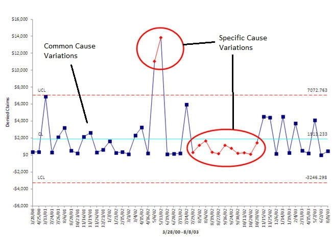
Project Quality Management – Control Chart – Common Cause vs. Special Cause Variations
Maintaining health of a process for continuously delivering quality product using control chart..
Whatsoever we are producing we see that our outcomes are not exactly identical. If we are producing any part of an automobile or a food product or anything else, we observe some variations. If the variation is very small, we may ignore it but variation still exist. These variations could be because of human errors or defect in a machine or error within acceptable precision in a machine, in the environment, changing temperature etc. Some of them may be acceptable to us as they are within our control limits but some may not be acceptable as they are categorized as defects.This concept is used in Control Chart to maintain the health of a process so that process always deliver quality product without any defect. It is also used in Six Sigma .
There are basically two types of causes that results into these variations. Common cause and specific cause. These terms are defined by Walter A. Shewhart and W. Edwards Deming .
Common cause variations is where combination of factors or no visible factor affected the process. It is a random variation while special cause variations are when one or more factors affected the process in a non-random way. Common causes are part and parcel of the process of production. Variations due to common causes are well expected and accepted. On the other side specific causes are unexpected. Specific causes produce variations which indicate error in the process and limit the capability of the process to deliver quality product. We cannot do much about common cause however special causes need to be identified and corrected for the process to continuously deliver quality product.
Common Cause variations
Common Cause variations are natural issues, noise within the process and random. Though variations are problems but as it is an inherent part of a process, it is expected. Variations due to common cause tells us that the process is healthy. Absence of variations due to common cause indicate some problem in the process.
Common causes examples: Vibration in industrial processes Ambient temperature and humidity Normal wear and tear
Attend PMP Prep Training and clear your PMP Certification Exam?
Click here to enroll yourself in next batch of PMP Certification Prep Training.
Special Causes variations
Special Cause variations are issues developed in a process. These variations were not observed previously and are unusual. They are some kind of defects in the system. Therefore special cause variations must be identified and resolved for the process to deliver quality products. Special cause variation arrives as a surprise as they are not expected and not welcome.
Special causes examples: Faulty controllers Machine malfunction Poor batch of raw material Power surges
Common cause variations are minor and caused by various environmental factors. They are random and well within accepted limits. Specific cause variations are caused by fault in the process. They may be within accepted limits but are big enough to suppress the randomness of common cause variations to generate a specific pattern. They are often used in control chart for early detection of fault in the process. If points in control chart lose its randomness and show a specific patter (rule of 7), it means process has developed a fault. This may be minor now (still producing product within accepted limits) but if remain unattended may start producing defective product (Out of acceptable limits). This may be major also which may produce product out of acceptable limits. In both the cases, process should be stopped and corrected before continuing.
Control Chart is one of the seven basic quality tools. PMBOK Guide lists these seven basic quality tool in tools and techniques for Project Quality Management. PMP Certification aspirants must understand these quality tools to prepare for PMP Exam. The concept of common cause and specific cause variations will help a PMP Aspirant to understand use of control chart in his/her study for PMP Exam. PMP Certification Training by pmwares covers all such concepts that are important for PMP Exam.
Leave a Reply Cancel reply
You must be logged in to post a comment.
You may also like
Top 6 cost estimation methods in project management.
In project management cost estimation is a very important process in which we predict the financial resources required to execute a project. It involves carefully analyzing various cost factors like labor, materials, equipment, and other overhead expenses. This analysis can help you and other stakeholders to make informed decisions about project budget allocation and resource management.
LinkedIn Workplace Learning Report 2024: A Summary
The research conducted by LinkedIn shows that the top 5 learning and development focus areas for 2024 are aligning learning programs to business goals, upskilling employees, creating a culture of learning, helping employees develop their career and finally improving employee retention.
Role of Design Thinking in Project Management
While technical skills are often important for project managers, very few people think about creativity as an essential skill for them. If every project manager will use the same tools, softwares and methodologies, what will make their deliveries unique from others? You must have heard that the most beautiful designs often emerge from the messiest explorations. Similarly, the most creative solutions are given by the most curious minds.
- PMP Certification Training
- MS Project Training
- Project Management Fundamentals
- Advance Project Management Training
- Project Risk Management
- Primavera P6 PPM Training
- PRINCE2 Certification Training
- PgMP® Certification Training
- Leadership Development
- Software Projects Estimation
- Function Point Analysis Training
- Project Management Process
- Project Management Office (PMO)
- Enterprise Project Management (EPM)
- Troubled Projects Interventions
- Coaching & Mentoring
- The Project Management Webinar
- PMP Certification
- PMP Success Stories
- Function Point Analysis

IMAGES
VIDEO
COMMENTS
A control chart can show two different types of variation: common cause variation (random variation from the various process components) and special cause variation. Special cause variation is present when the control chart of a process measure shows either plotted point(s) outside the control limits or a non-random pattern of variation. When a ...
Common Cause and Special Cause Variation Detection. Control chart. One of the ways to keep track of common cause and special cause variation is by implementing control charts. When using control charts, the important aspect to be considered is firstly, establishing the average point of measurement. Next, establish the control limits.
Common-cause variation is the natural or expected variation in a process. Special-cause variation is unexpected variation that results from unusual occurrences. It is important to identify and try to eliminate special-cause variation. Out-of-control points and nonrandom patterns on a control chart indicate the presence of special-cause variation.
This adequately explains the presence of special cause variation on the control chart. Summary/Conclusion. Variation in a process is normal and expected. Over a given period of time, it is essentially unavoidable. Nevertheless, by understanding control charts and being able to recognize variances that are typical for the process and those that ...
The authors' SPC charts reveal examples of both common cause and special cause variation. Common cause variations are those causes that are inherent in the system or process. 4 Evidence of common cause variation can be seen visually in the OA's Fig 3, from January 2017 to October 2017, because the data points vary around the mean but remain ...
With this strategy, additional processes are incorporated into operations that prevent or counter a special cause variation. 2. Recognize them on a control chart. Remember that if it falls plus/minus three deviation limits of a measurement on a control chart, it is probably a special cause variation. 3. You can avoid over-tampering
Interpreting charts to identify special cause variation If you can see any of the following it means that there is special cause variation. The first four rules can be applied to both run charts and control charts: 1. Shift - seven or more successive data points falling on the same side of the centreline 2.
Control charts can be used to identify sources of variation, both common and special cause. Common cause variation is the variation inherent in the process. Common cause variation is also known as the noise of the process. A process with only common cause variation is highly predictable. A process that has a significant inherent common cause ...
Identifying Special Cause Variation. Special cause variation is often difficult to detect without the right analysis tools. Identifying special causes requires going beyond typical process monitoring to specialized statistical techniques. There are three main methods for recognizing when variation is due to special causes: Control Charts
Control Chart Rules are helping us to identify the special cause of variation from the process and by eliminating variation make our operation smooth. ... some possible causes which are responsible for the special_cause of variation and identified by chart pattern are mentioned in the below table. 👉 See Also: All Topics ISO 9001:2015 & IATF ...
In addition, you want to draw the control limits for all control charts at 2.5σ instead of 3σ. Choose File > Options > Control Charts and Quality Tools > Tests. From the drop-down list, select Perform all tests for special causes. Minitab will now perform all applicable tests when you create a control chart.
A fundamental concept in improvement science is understanding the difference between common cause and special cause variation. By understanding how to apply these concepts to your data, you will more quickly identify when a change has occurred and whether action should be taken. The authors' SPC charts reveal examples of both common cause and ...
These type of questions can help guide brainstorming sessions to find the reasons for the special cause of variation. The type of pattern can guide your analysis of the out of control point. Summary. This publication took a look at the 8 control chart rules for identifying the presence of a special cause of variation.
Common and special causes are the two distinct origins of variation in a process, as defined in the statistical thinking and methods of Walter A. Shewhart and W. Edwards Deming. Briefly, "common causes", also called natural patterns, are the usual, historical, quantifiable variation in a system, while "special causes" are unusual, not ...
The use of control charts helps to differentiate between the common cause variation and the special cause variation, making the process of making changes and amends easier. Learn new trends, emerging practices, tailoring considerations, and core competencies required of a Project Management professional with the PMP Certification course.
If the process is unstable, the process displays special cause variation, non-random variation from external factors. Control charts are simple, robust tools for understanding process variability. ... Figure 17: Xbar Chart Within Variation. This is close to being a graphical analysis of variance (ANOVA). The between and within analyses provide ...
Control charts, such as the X-bar chart and the individual/moving range chart, help distinguish between common cause and special cause variation, enabling proactive intervention when necessary. Root Cause Analysis (RCA) : RCA is a systematic approach to identifying the underlying causes of problems or deviations from the norm.
Common Cause Variation and Special Cause Variation Charts. A control chart is a graphic presentation of data over time against control limits, with a centerline that assists in detecting a trend of plotted values. Control charts show how processes go over time; they predict if the project is in control. A process is in control if the ...
Common Cause - Special Cause. 60.9 KB Common Cause - Special Cause - Solution. 61.3 KB. SPC Control Charts are designed to differentiate between special cause variation and common cause variation. In order to understand the importance of this and the implication for control, this lesson explains and illustrates the differences.
Special cause variation refers to unexpected and assignable events which can affect a process. These are variations that were not observed before and are unusual, non-quantifiable variations. ... (BB) was helping the manufacturing manager monitor his machine setup time with a control chart. He noticed that at point 65, an upward trend of ...
Making the right assessment can be difficult without the right tool: a Shewhart chart, also known as a control chart.Shewhart charts, which display data over time with upper and lower control limits, are the only way to differentiate between common (predictable) and special cause variation. Common cause variation is inherent in the process ...
Assignable cause, also known as a special cause, is one of the two types of variation a control chart is designed to identify. Let's define what an assignable cause variation is and contrast it with common cause variation. We will explore how to know if your control is signaling an assignable cause and how to react if it is.
It is a random variation while special cause variations are when one or more factors affected the process in a non-random way. Common causes are part and parcel of the process of production. Variations due to common causes are well expected and accepted. On the other side specific causes are unexpected. Specific causes produce variations which ...